Chikalicious Dessert Bar website
Chikalicious is an iconic Japanese fusion desserts spot in New York. Their 3-course Prix Fixe menu is best described as American desserts, French Presentation and Japanese tasting portions. They also have a good selection of dessert wines and champagne, along with organic coffees and teas.
Back in 2017, with another two collegues, we were in charge to redesign Chikalicious website which hasn't been updated ever since 2013. Being a loyal customer, I was super excited with the opportunity to work for the nice cozy desserts spot. On the other hand, it'll help the restaurant to attract new customers since it's a quite famous especially for tourists. In addition, having a delicate website will also contribute to maintain loyal ones, and raise the overall profile of the establishment outside of the physical location.
What I have done in this project:
- Analyze and revise information architecture of the current site while maintaining the integrity of information.
- Create new user interface, and new graphic elements.
- Create clickable prototype for developers.
- Usability testing with collegues, and real customers.

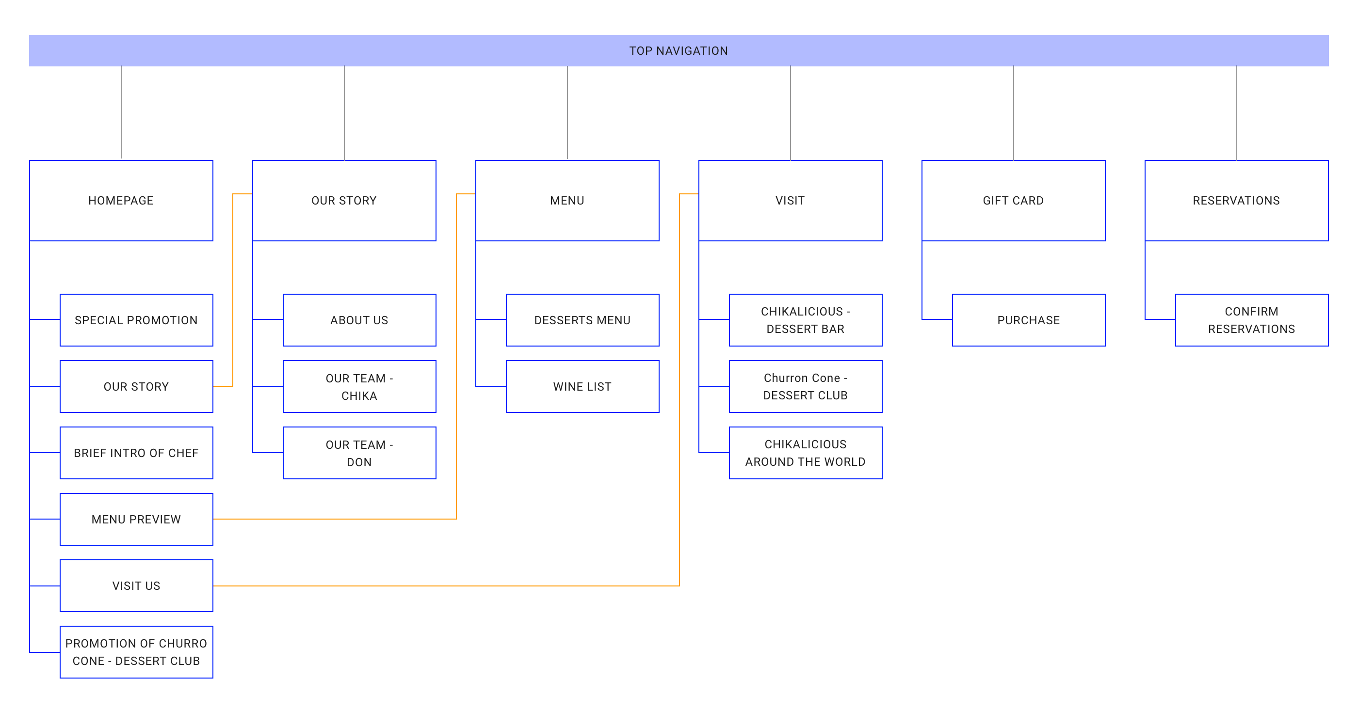
Essential User Flow of the Website
Some of the client's requirements:
- 1. Chikalicious isn't just a desserts bar, it's more of a elite French restaurant but only sells desserts and pairing wine. The preferred style would be classic, elegant and visually appealing.
- 2. Showcase the special promotions on homepage.
- 3. Link to Churro Cone dessert club as it's the new focus of the brading identity.
- 4. Try not to change too much on information structure but adjust it to make improvement.
Current Website UI Analysis
Current Homepage
1. Lacking main navigation. also information on the homepage needs to be organized better.
2. The usage of primary color emphasizes the brand identity. However the color might not convey the elengance too well.
3. Hard to locate the store info and information about reservations.
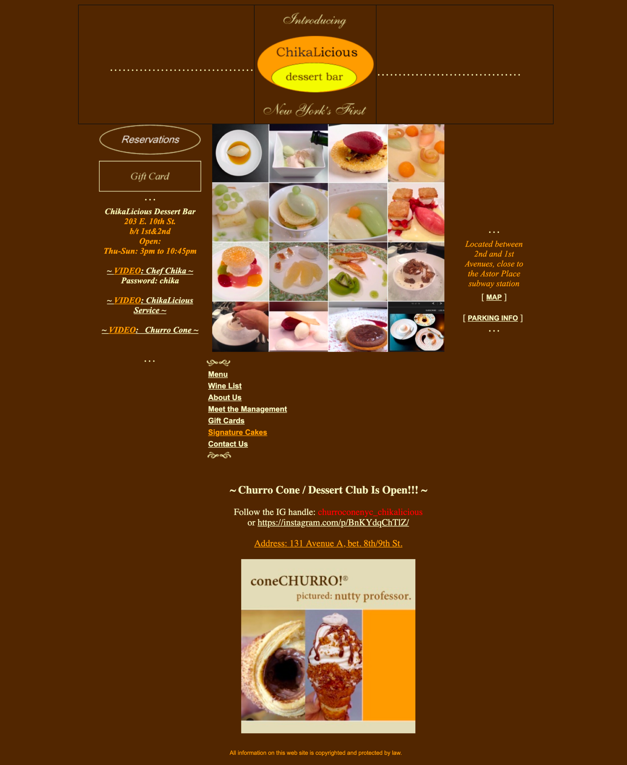
Current Reservation Page
1. When clicking into Reservation section, users will be navigated to a newly opened tab instead of staying at current web page.
2. The grouping of the menu item needs a clean up.
3. The color usage on this page changes, ideally it should keep the consistency across out the whole website.
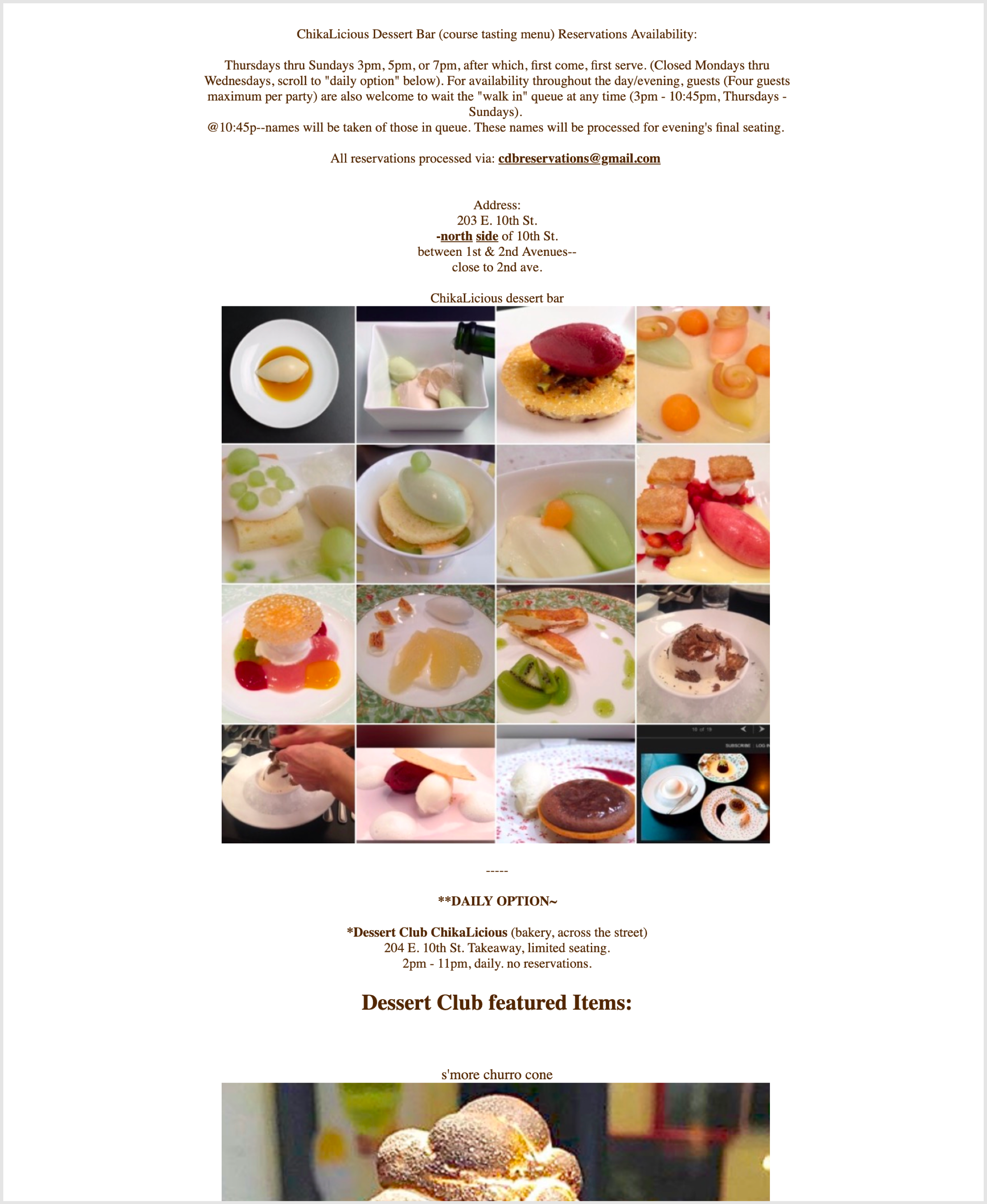
Current Reservation Page
1. When clicking into Reservation section, users will be navigated to a newly opened tab instead of staying at current web page.
2. Users cannot reserve a table from this page.
3. Additionally there're too many desserts images in the feed underneath that frustrates users.
The Visual Design
For this project, my primary goal is to design a website which is easy to use, clean and elegant. While designing, I kept in mind the website needs to be mobile display optimized as well. I skteched out the mobile wireframe before the web one. During the process of creating visual design, I kept the consistency in check.
The color palette is created based on the company's logo and identity - while with client's permission I did a redesign of its logo - thus to ensure the legibility and readability of text, graphs and other elements.

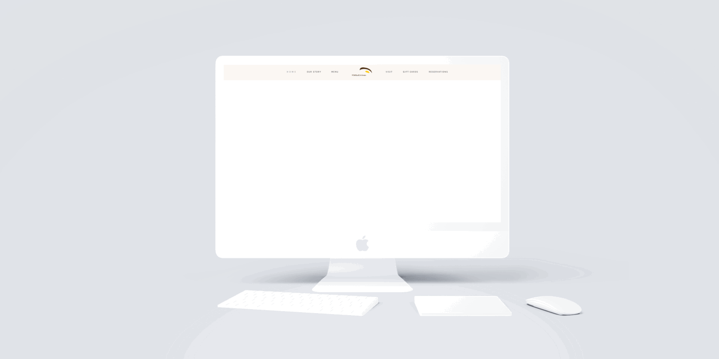
New Homepage
The new homepage puts the navigation to the top header, with logo centered.
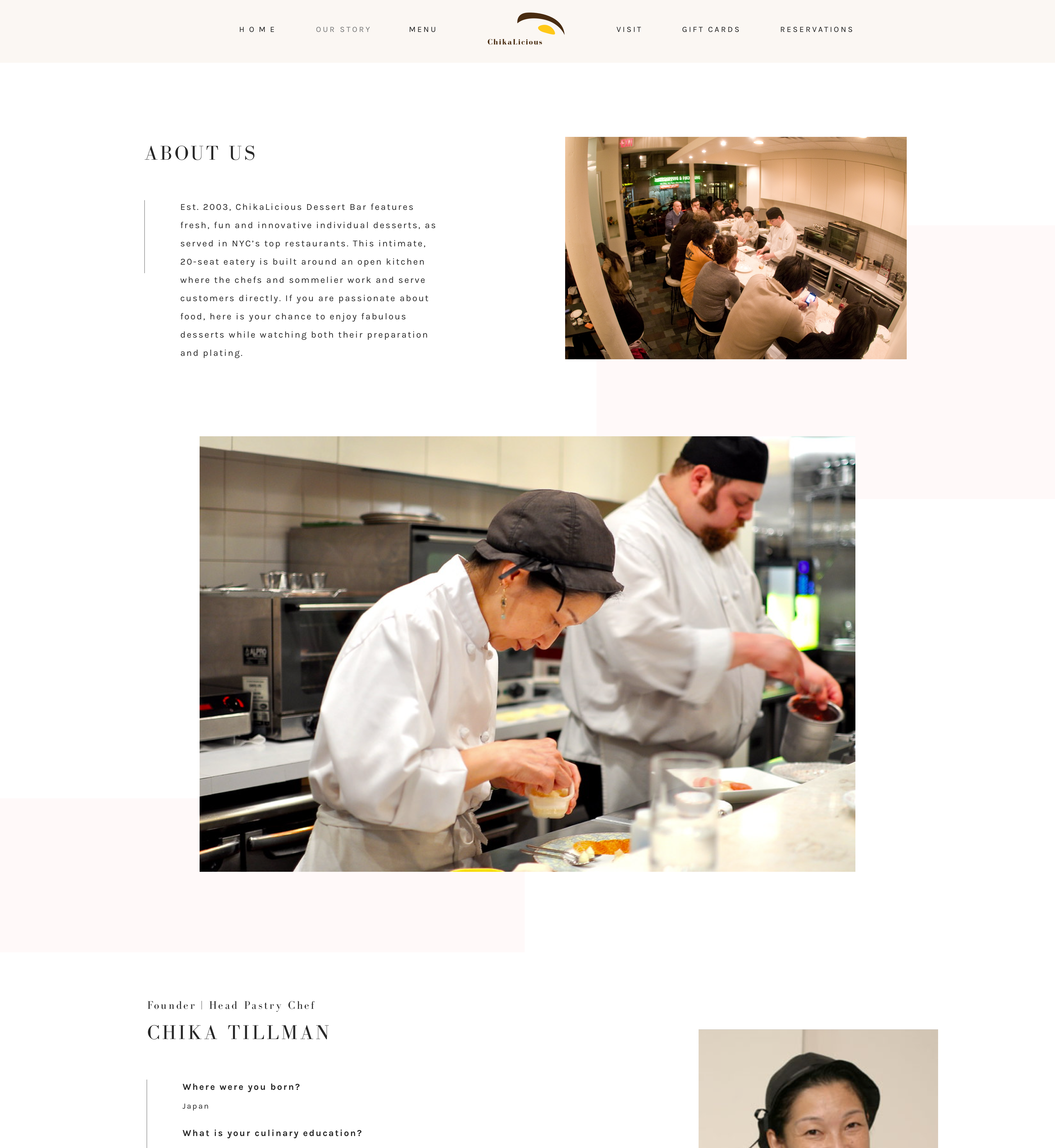
New About Us Page
The About Us page contains info about the desserts bar and brief interview with the two founders of Chikalicious.
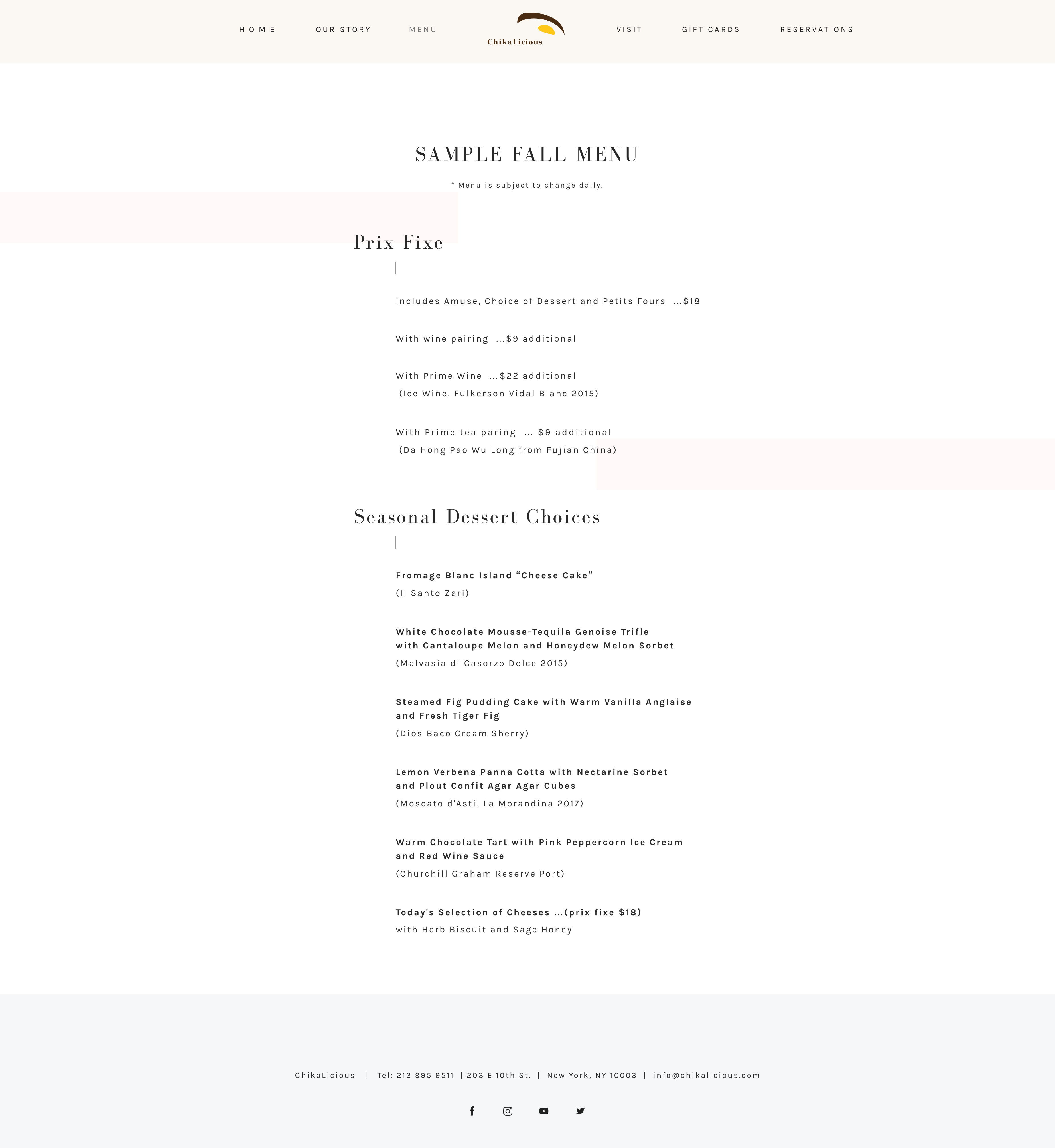
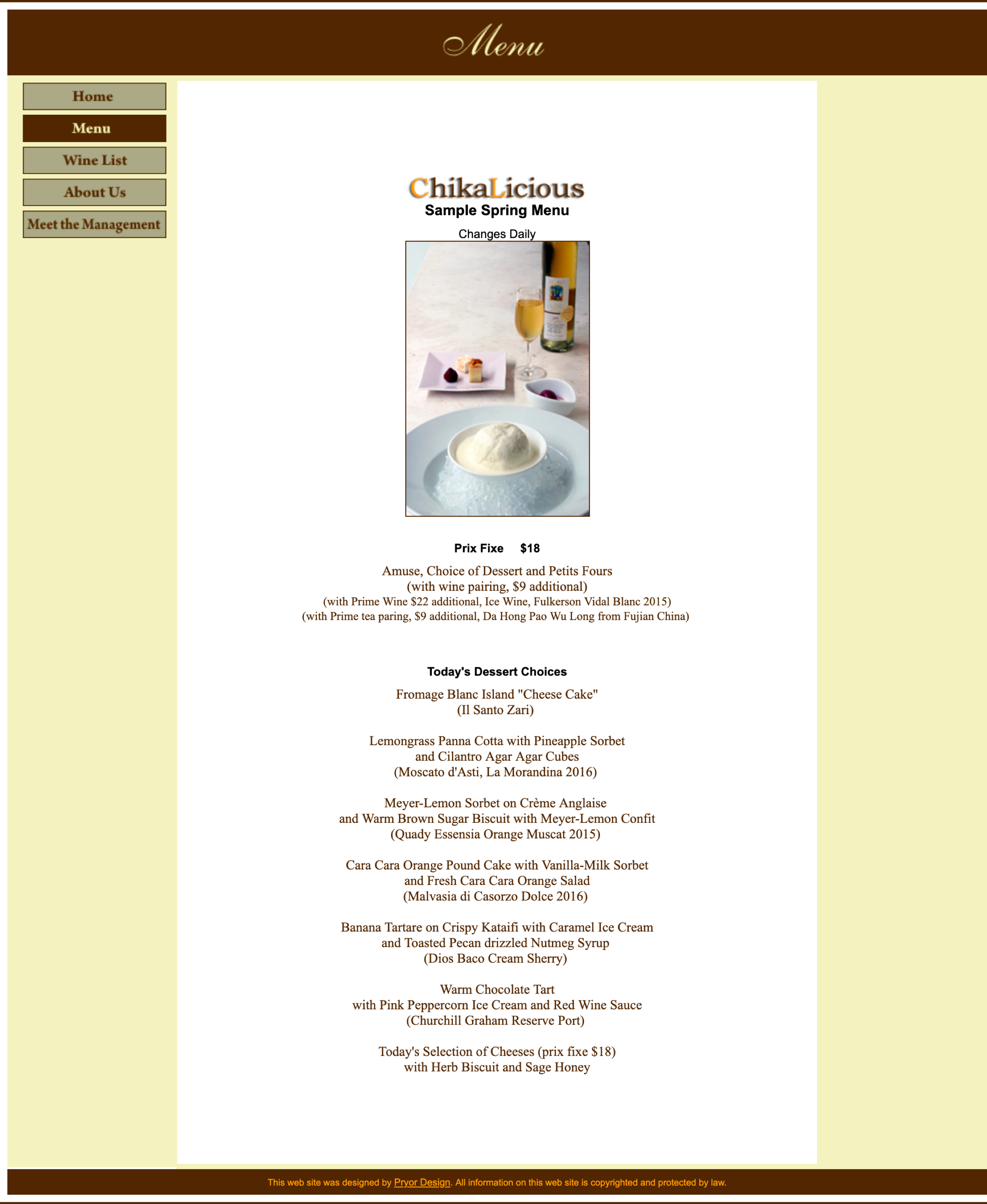
New Menu Page
I cleaned up the layout of the Menu page for a better reading experience.
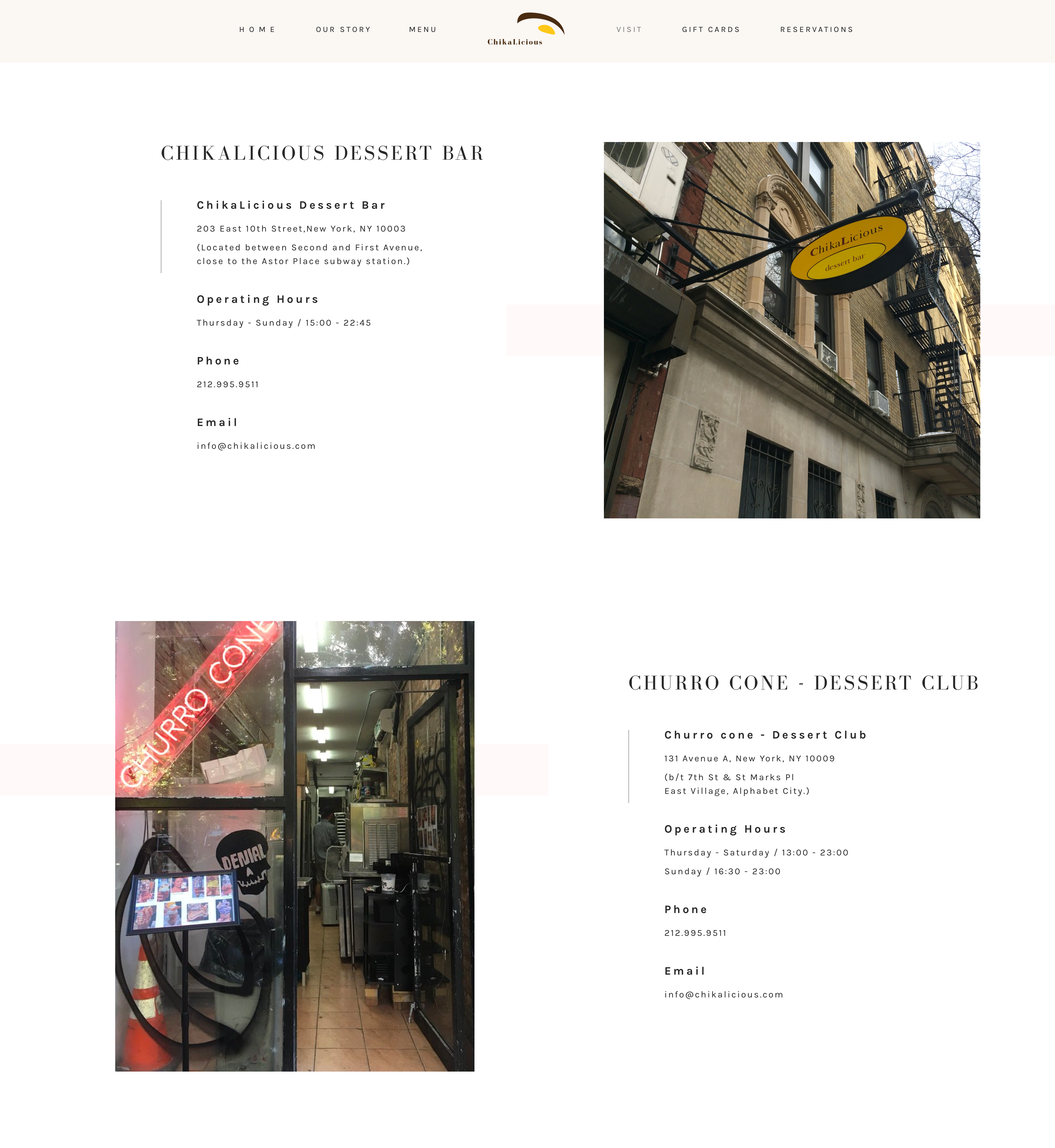
New Visit Us Page
The new Visit Us page refers to the desserts bar, the Churro Cone dessert club and the Chikalicious branches store all around the world.
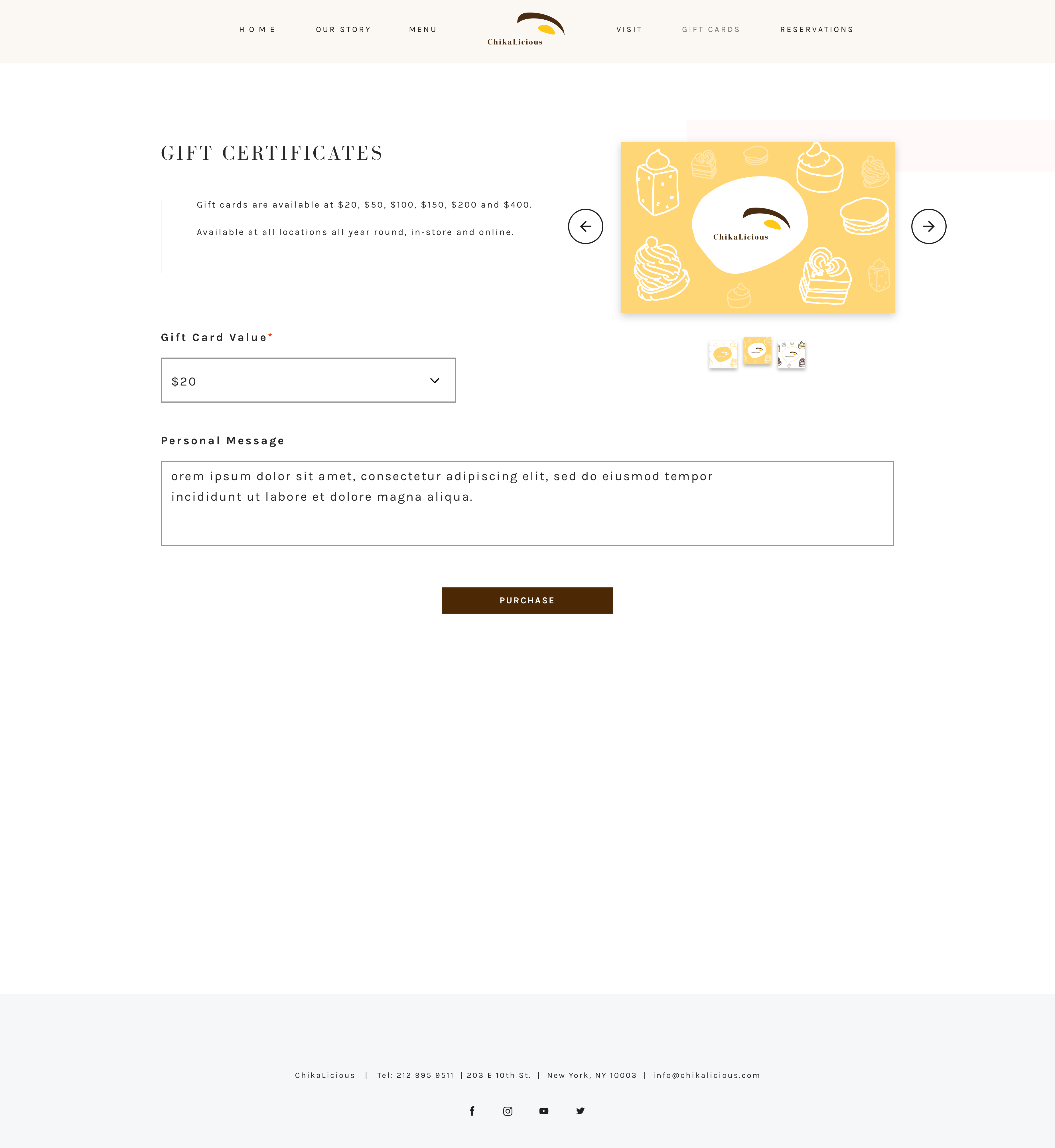
New Gift Card Page
A generic Gift Card page enables users to purchase gift cards of various face value. I illustrated the gift card design as well.
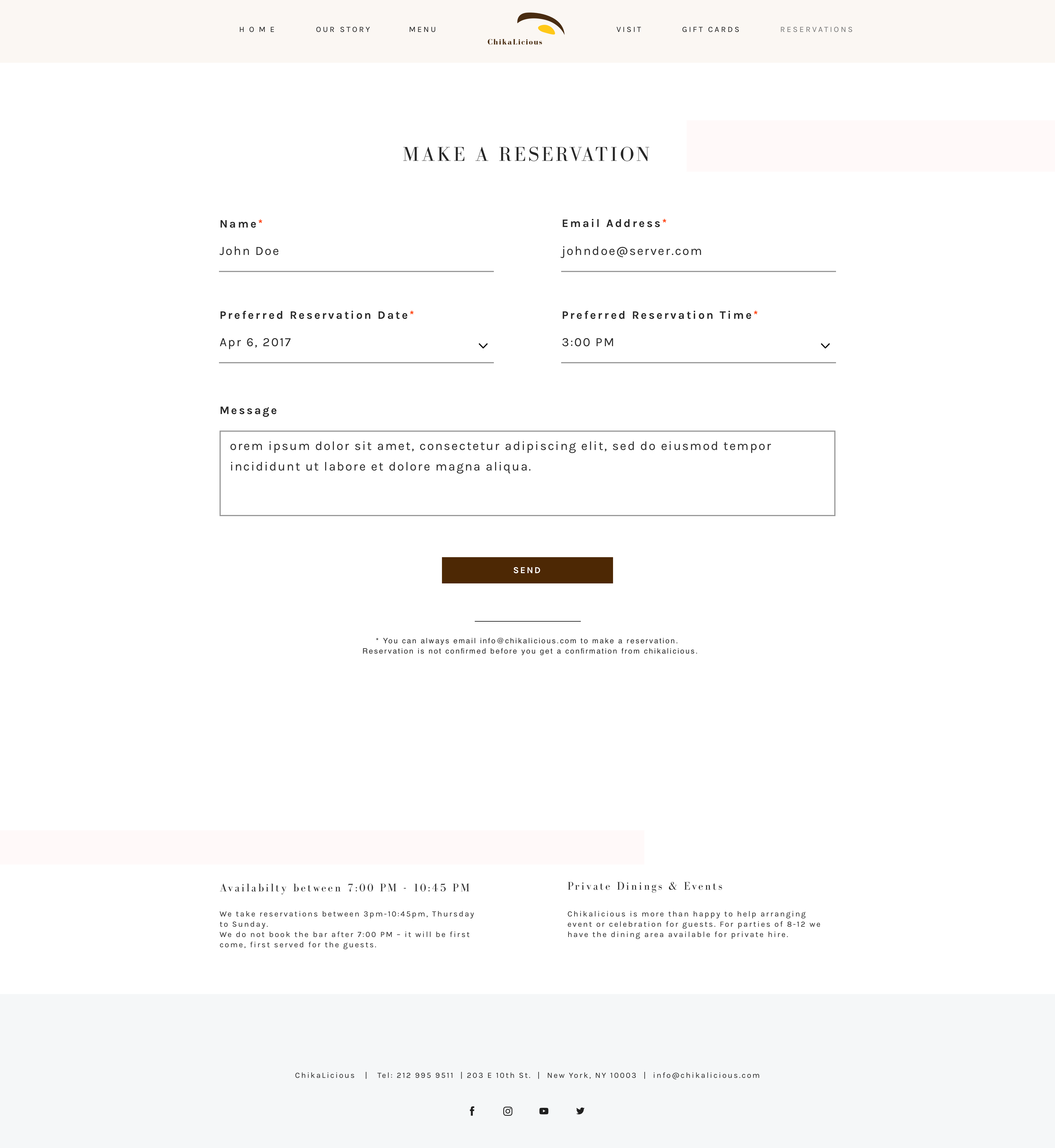
New Reservations Page
Users can navigate to the new Reservations page to select, confirm and inquire the details of reservation, with other event reservation information available at the bottom.