1. Product Overview
Urban FT is a B2B startup to provide white-label digital banking apps(iOS, android and web) for over 700 clients, the majority of which are community banks and credit unions. I joined the company at September 2015 when Urban FT has raised a concept to combine financial and social services.
I put selected work i did during the two years period into sections. Please navigate through menu on left side when browsing.
- The guidelines, including UI Kits and pattern library.
- The App, including iOS, android and Web. Here I mainly used iOS screenshot as reference.
- The visual elements and motion graphics.
- The Urban FT website iteration.
2. Design System
When I joined Urban FT, the company just established a new identity, but yet to unify the new pattern and apply to use across all the screens. As a UI/UX designer, i wrote the following notes at that point:
- Design inconsistency has been a huge issue.
- I wasn't able to find any previous documentation of style in use, that slows down the process of us applying new style. That might be a bigger problem if we ever need to change branding identity again.
- The product team need to create a design system/pattern library to document all elements.
2.1 Getting started with Colors
I had bandwidth back then, so i took the responsibility of building design system at beginning.
Troubles with the color palette were the first thing came to me. As a B2B company, Urban FT provides customized features to clients including color palette. However, it'll become troublesome for us to design and also no good for our branding identity. Some clients app screens are like these:
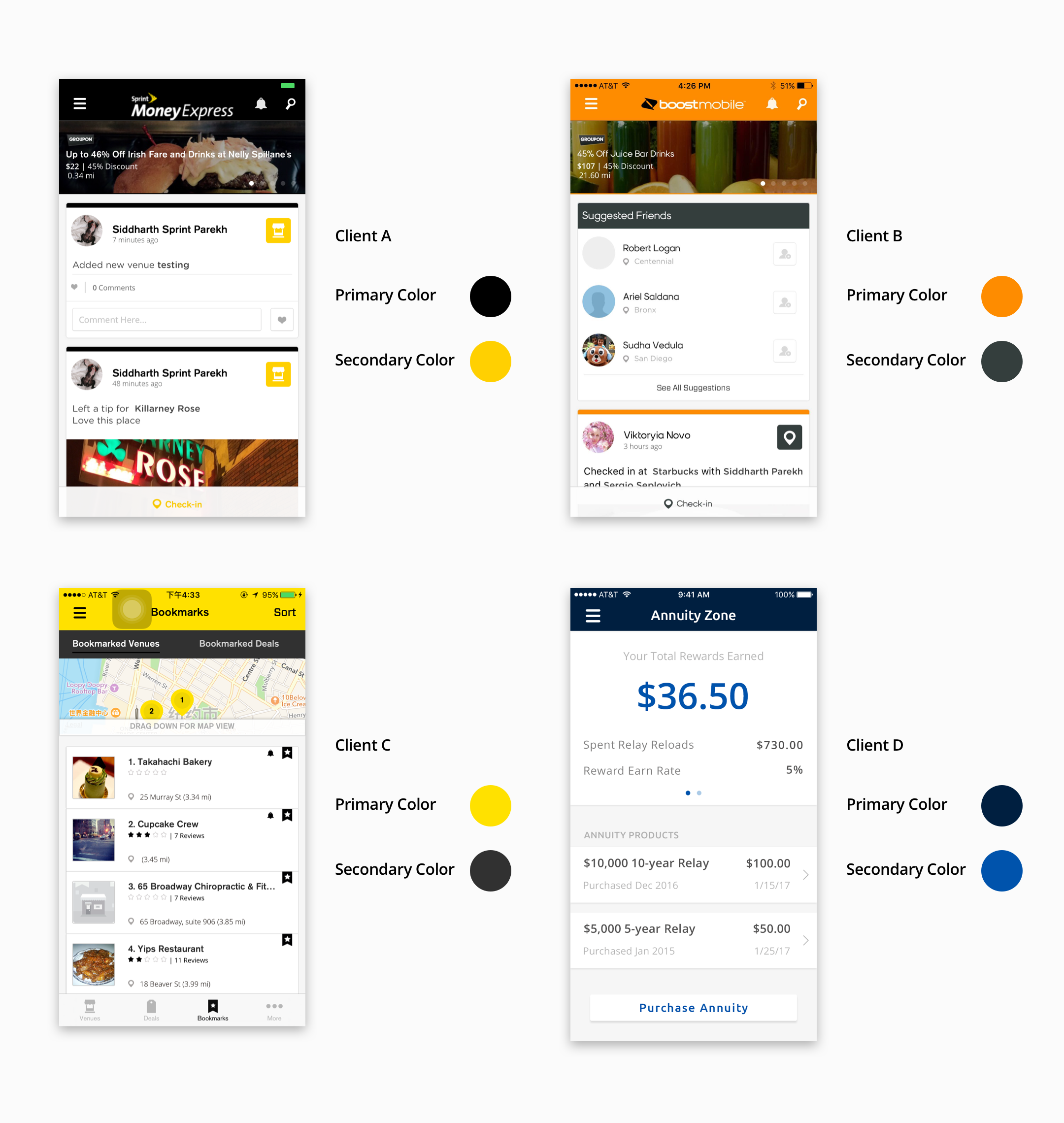
It's not ideal to create color palette for each indivual client, so our solution is to have a complementary color palette to match to most of clients' primary and secondary color choice - assuming they already have their branding color, if not we'll bring up our color suggestion for them as well. Below is a clip from the complete color libary
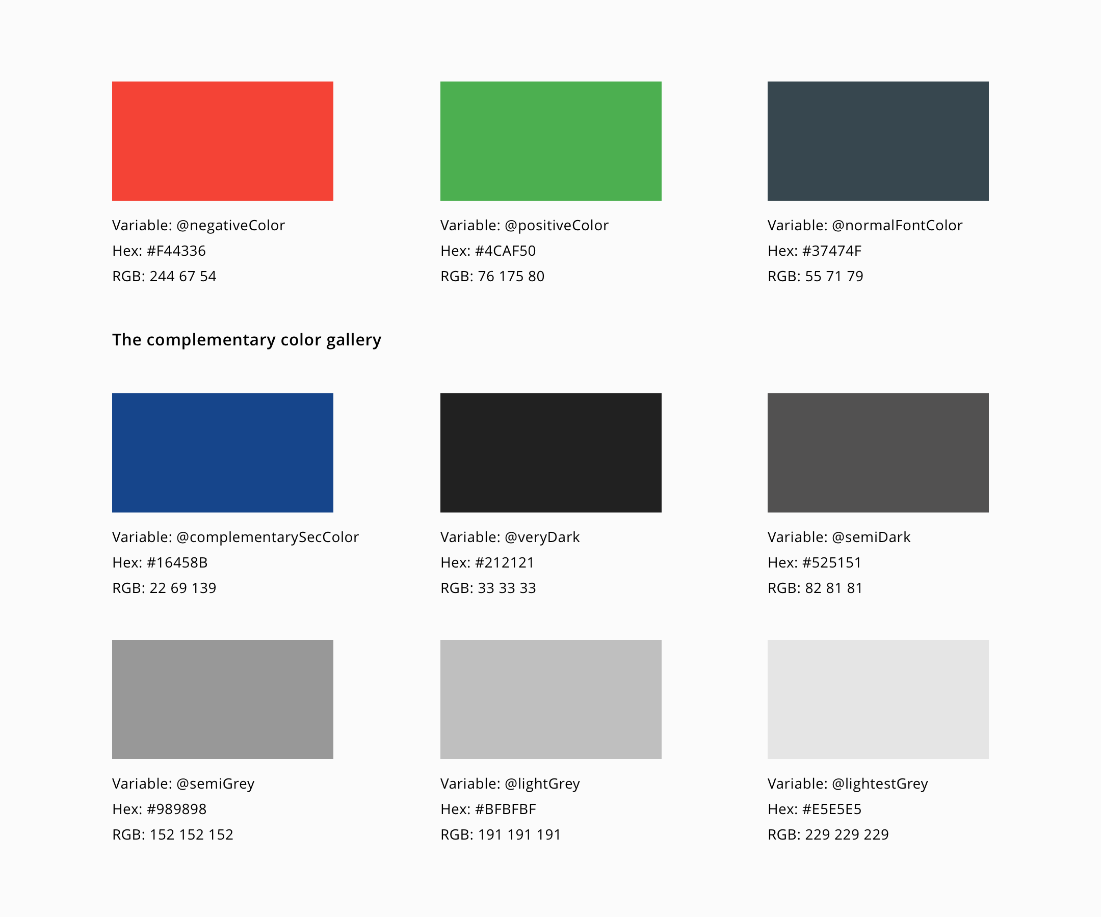
To create the color library, i first listed all the colors we currently used across the platforms, and started to sort and categorize them according to usage, and hue. when this step was done, i got a full specturm of the palette. However, i was looking at over 60 colors and didn't know how to proceed with so many colors.
After doing some research, i had an idea to quantify the colors in usage by literally counting the number of times each color is actually used in code. Checked with developers, it's not easy to do that with iOS and Android code while it can be easily done with web. Since we have consistent design style across mobile and web platform, counting colors from web works in this scenario.
The color palette solves some problems that has been existing for a long while
- 1. Unify the names so it would be in an easily understandable format for both designers and developers
- 2. Reduce the number of colors that looks almost identical but with differenct hex code
- 3. Form a palette of a sufficient number of shades of grey for text according to different scenarios, i.e disabled text or enabled text.
- 4. Clients can choose their primary colors, and we will make sure the colors work with the complementary colors we have.
From the Redesign process - I'll mention it in the "The App" Tab - we also learnt we should minimize the usage of vivid colors and also avoid too much usage of colors as it'll help users to focus more on content and not be distracted from unimportant elements.
2.2 Dive into Atomic Design
Documenting the design patterns will not only benefit for designers designing for new screens but also for developers to take reference. After doing lots of research and read a series of examples, Atomic Design is the direction I'm going for.
2.2.1 Atoms
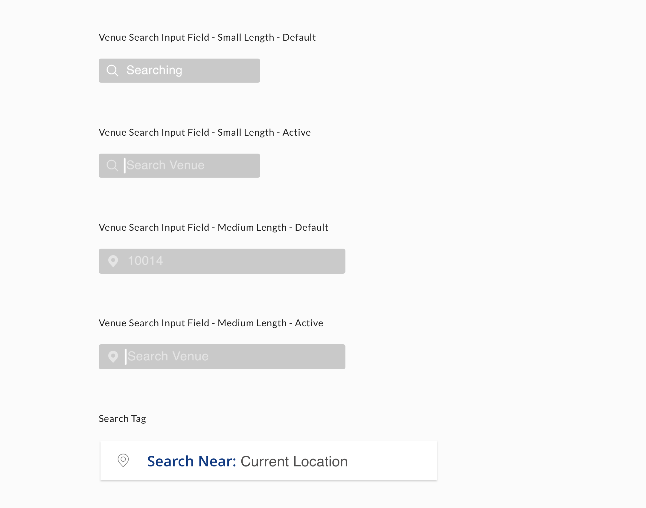
On the Atoms leve, there are fonts, color palettes, buttons, text boxes, labels. Color palette is also a part in it.
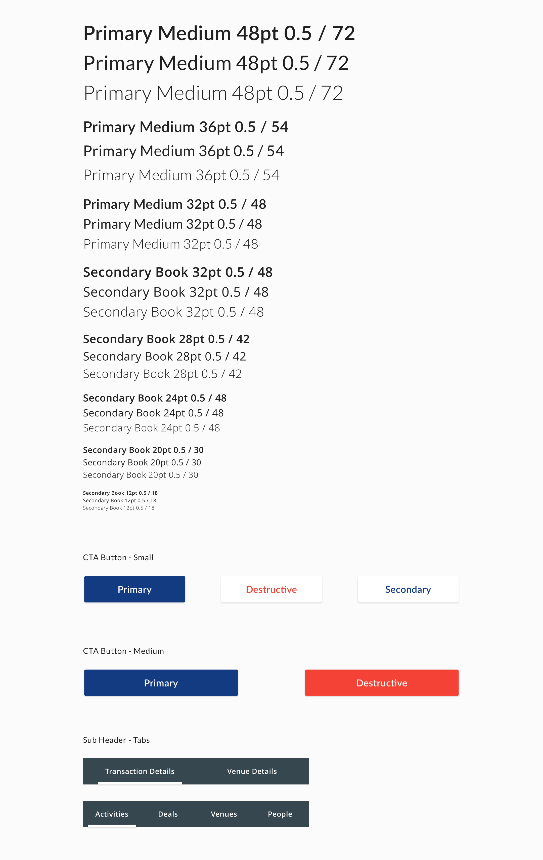
2.2.2 Molecules
A combination of these atoms will then form a Molecule, like a card that is composed of atoms. It refers to the UI that's more complex on the level.
2.2.3 Organisms
Organisms are from a higher level where we combine molecules to create more complex UI. Like a header nav, a feed card, a venue detail card, etc.
2.2.4 Templates and Pages
By combining multiple organisms we have Templates. More like wireframes, templates enable developers to start to work on the code before the high fidelity mockup are available. It saves so much time compared to when we don't have design system documented.
And for Pages, that's the ultimate high fidelity mock of templates. Combining all above will become a page. That's how everything putting together in the design system.
2.3 Documenting with Sketch
From my own experience, Sketch works great by Atomic Design Methodology where the design elements are easy to pick up and use. With sketch you can organize all elements into Symbols, it allows you to change all of the style on one single elements easily and also apply it to all similar elements.
2.4 Conclusion
That's how i created the draft of design system, although i only talk through it briefly, it took me almost a month and a half to put everything on file and present it to team. The team members later joined me to complete the whole design system.
3. The App
3.1 Background Story
Urban FT has the white-label app in Android, iOS an web. The UX is consistent while UI is slightly different to accomodate various platform. However, the initial release of the app was in a rush and didn't really think through the whole idea before launching it. The users struggled with serveral bugs and the team realized we needed a redesign from 2016 spring. It was originally assigned to me as to redesign section by section - started with a small social section. However I feel like that's not the right way to do so - we're doing things backwards. Talking with the team members and had several whiteboarding sessions, the scope was obviously larger than we anticipated that two other designers joined after i iniciated the project months later.
3.2 iOS app redesign - scope defined
3.2.1 The Problem
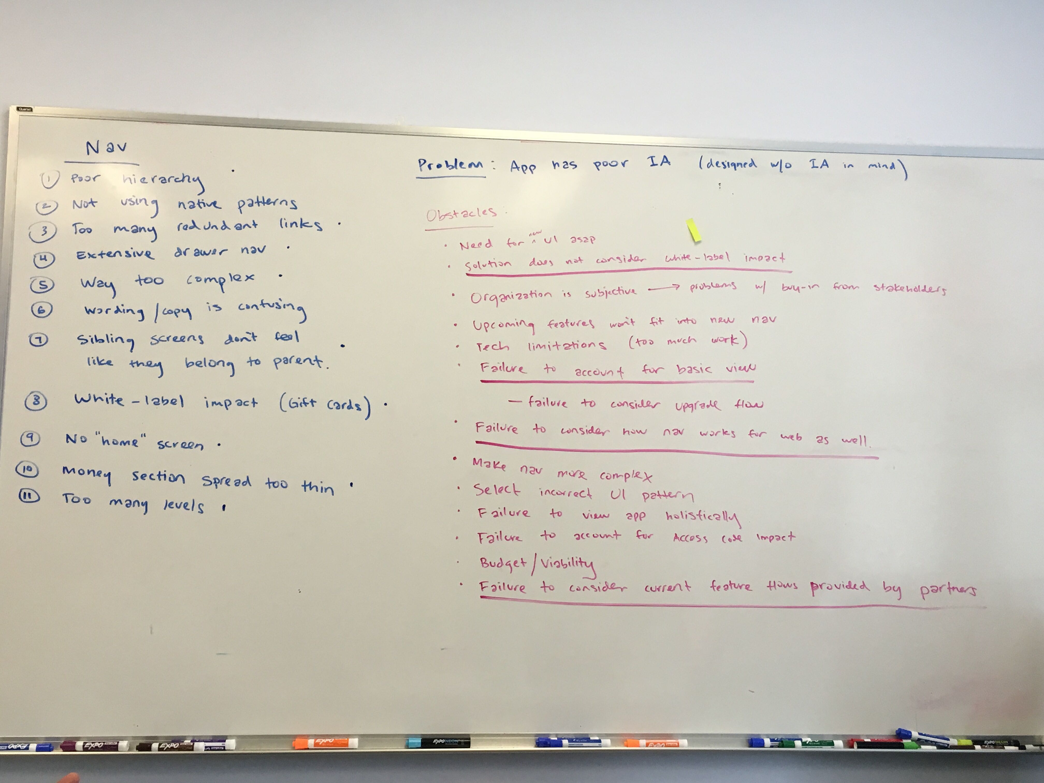
Working on the early days, me and my collegue designers had a consensus that the app app has poor Information Architecture when designed. It leads to the project which is to have the app redesigned. Through the whiteboarding session we listed the issues our users experienced:
- • The current UI doesn't consider the white-label impact - when the branding of clients applies it'll affect the way UI looks and we didn't count that in mind
- • Poor hierarchy, way too complex in structure
- • Not using native pattern lost the users' familiarity
- • Too many redundant links without proper grouping while sibling screens don't feel like they belong to the parent ones.
- • Wording/copy is confusing
- • The current home screen doesn't feel like "home" screen.
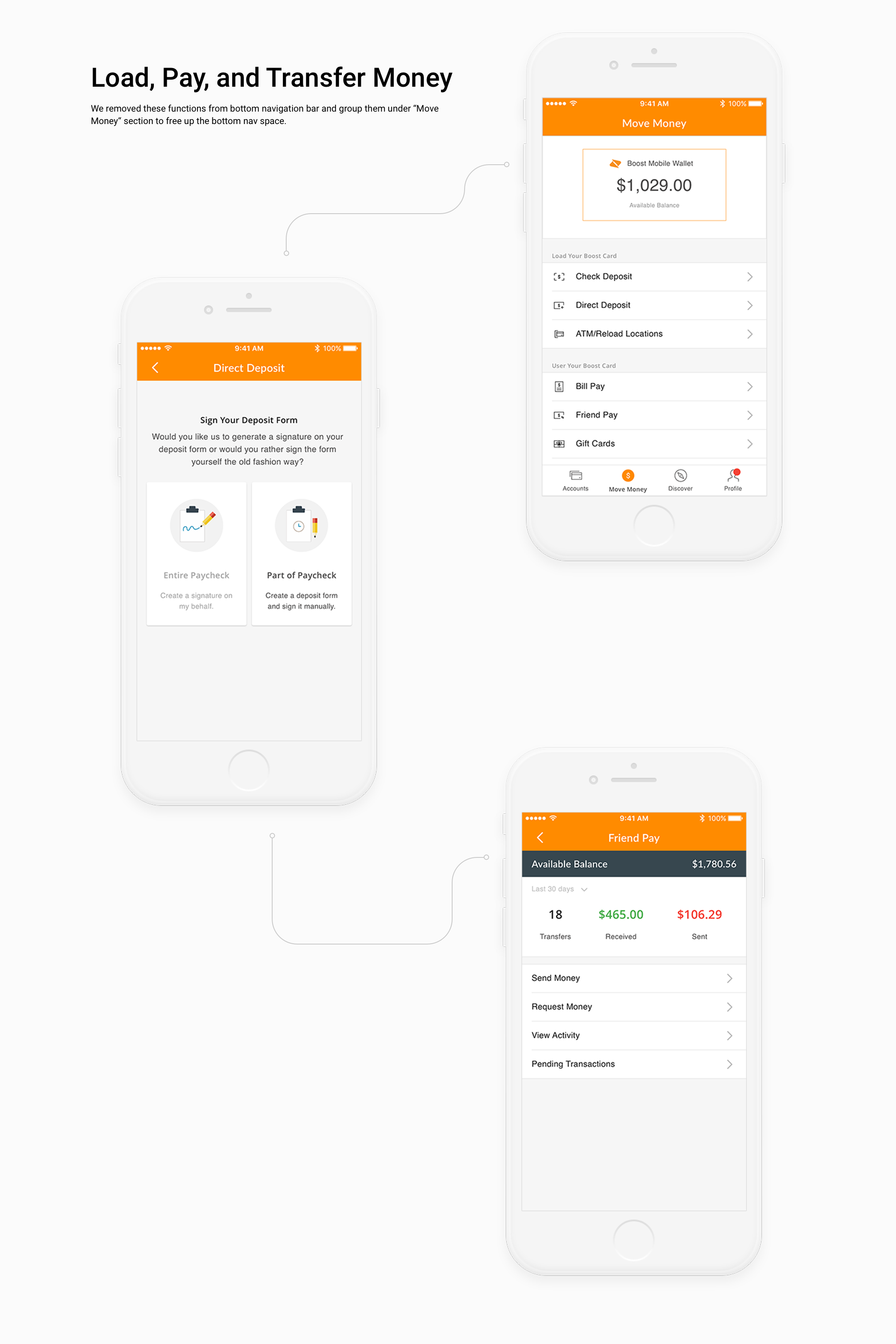
- • Money section spread too thin
Other obstacles include: the current app didn't account for the disguish between basic view and upgrade, while we intended to encourge users to upgrade in the redesign; the extensive drawer navigation should be replaced yet needs to be consider how new navigation works for web as well.
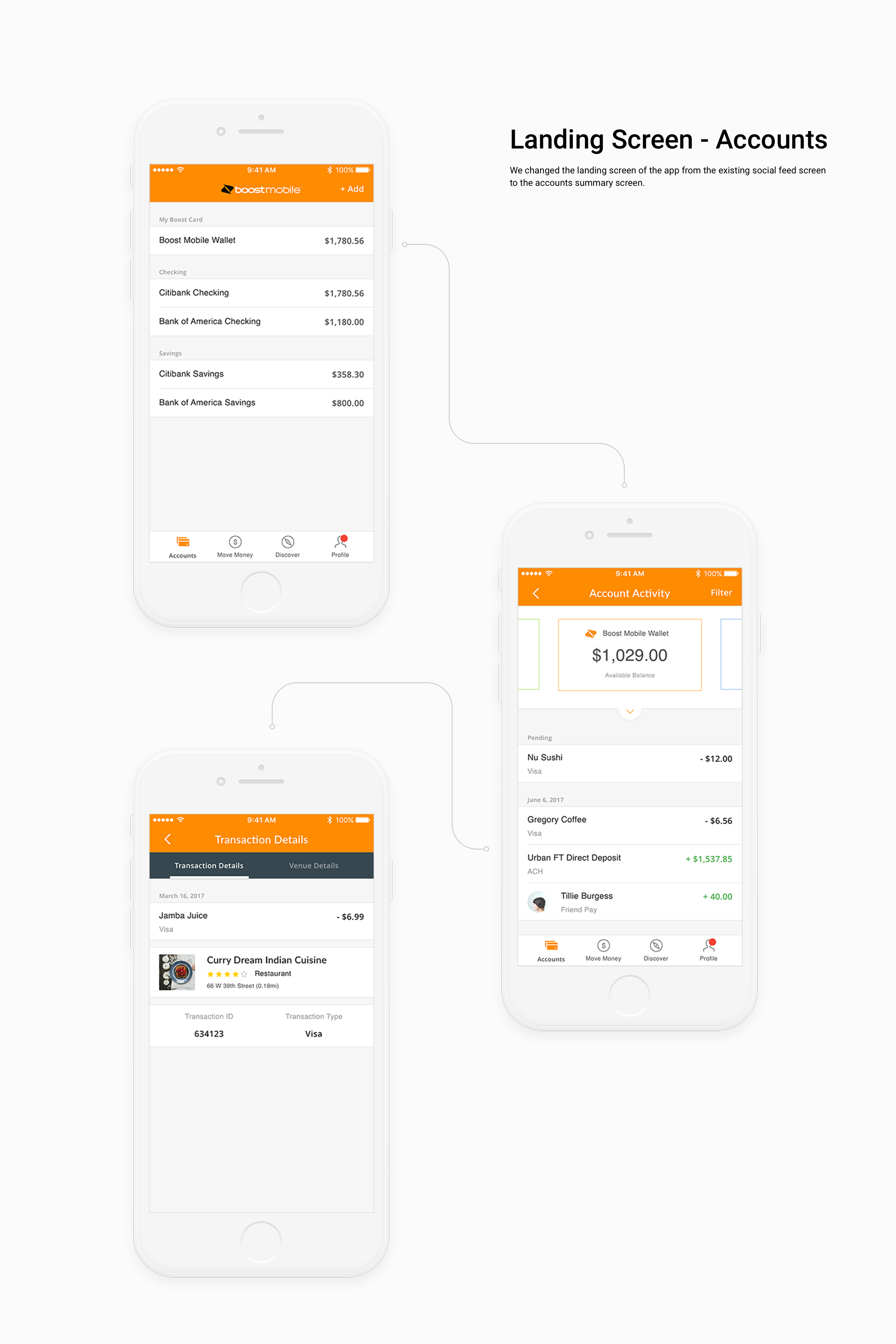
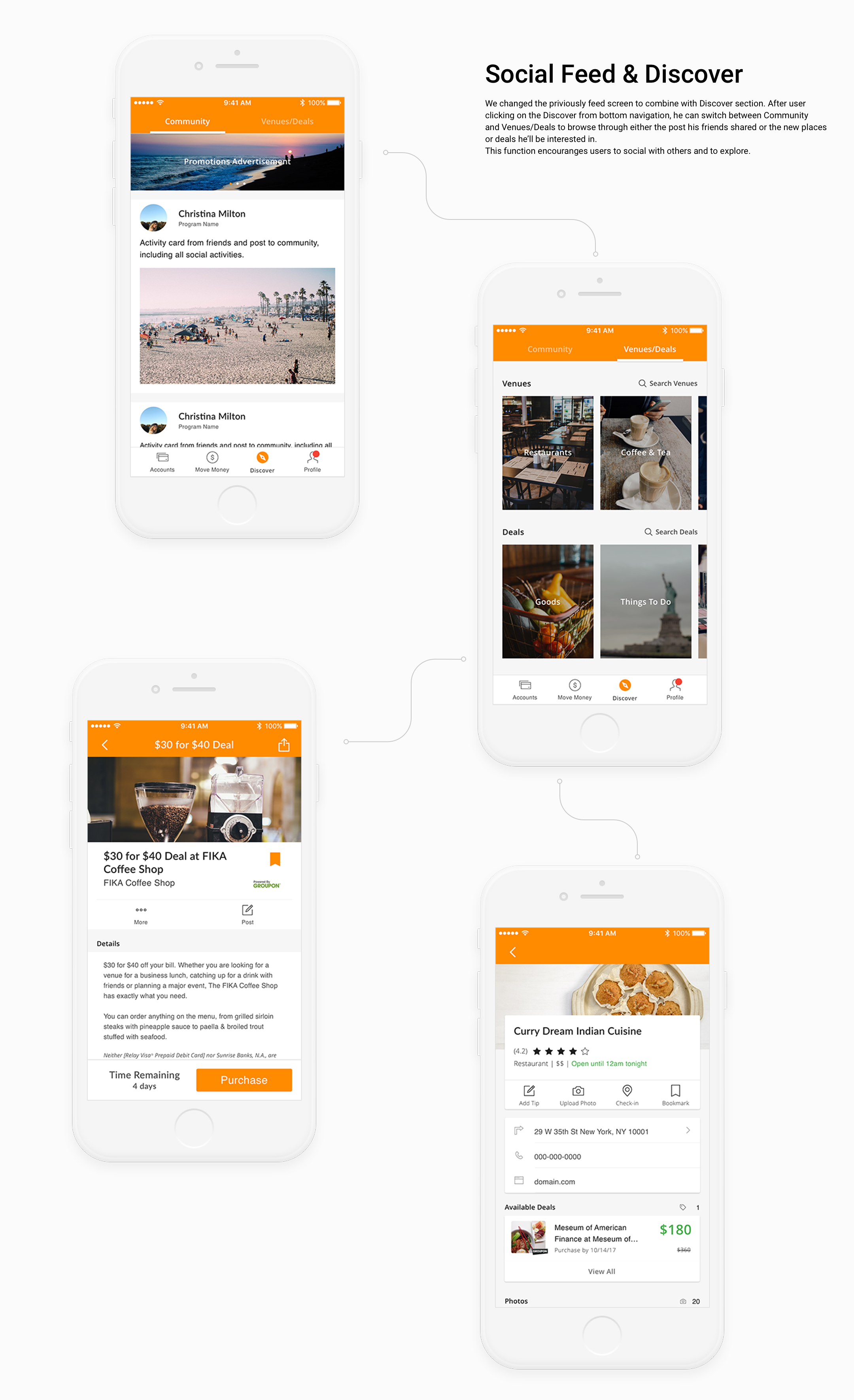
From the data we got from our clients, iOS is the most widely used platform where users download the app. We decided to apply the redesign process from iOS app. The objectives include to raise customer engagement through personalized feed, generating trending venue and deals, and providing customers with useful and relevant content that enhances their Urban FT app relationship.
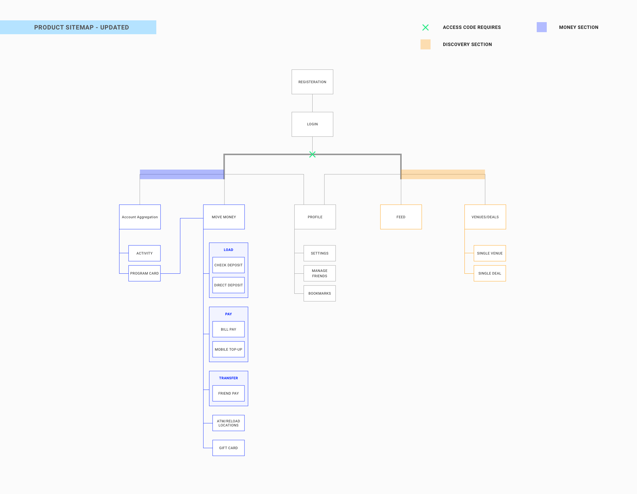
3.2.2 Original Site Map V1
First step for me was to list the current stucture of the app and make it cleaner.
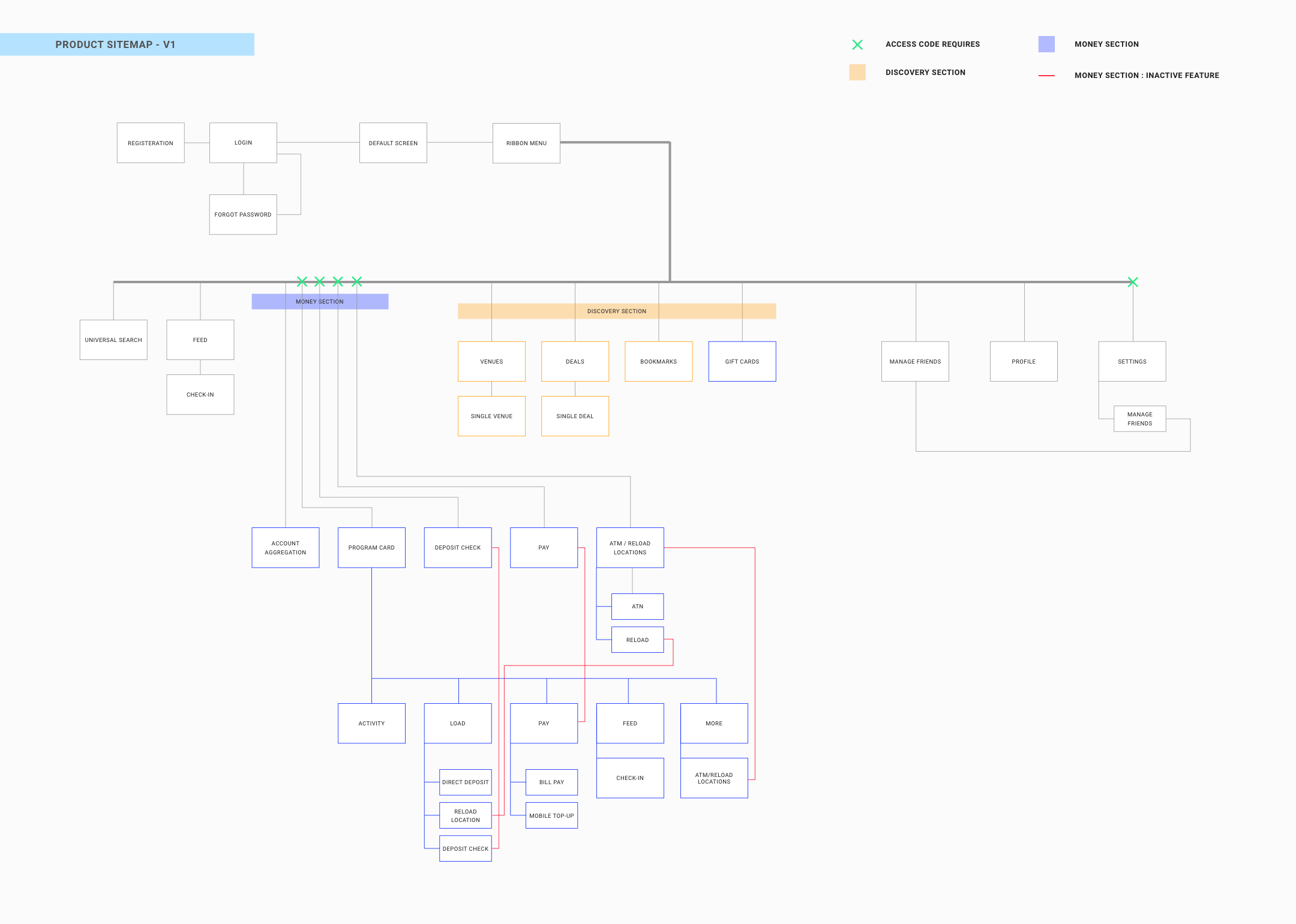
Some key notes from the sitemap
- 1. Urban FT apps enable users to combine social activity with financial features. However from our old navigation, user access these two sections from off-canvas side menu(ribbon menu). It feels disconnected and two individual features that have nothing to relate with the other.
- 2. Each section has its own hierarchy tree and goes really deep. It takes users lots of time just to navigate through sections.
- 3. There are quite a few repeated sections in financial part. The overall navigation needs to be updated.
- 4. Still, financial section is the core for our app. While general users can access a few functions from it, they have to upgrade to use the full collections of functions. We currently don't put enough attention on how to attract users so they'll upgrade.
And I conducted a brainstorm session with them to gather ideas and thoughts.
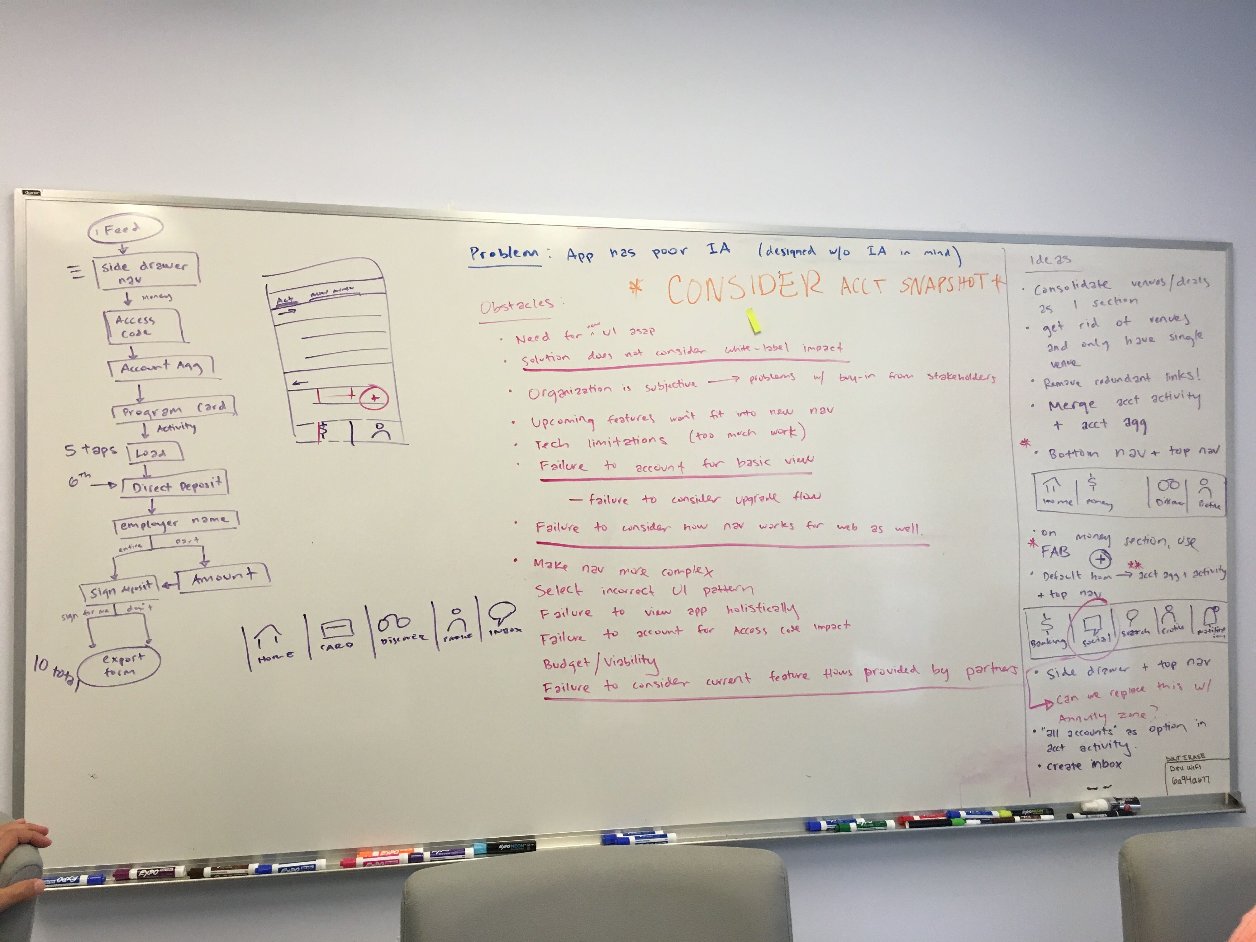
3.2.3 Redesign Flow
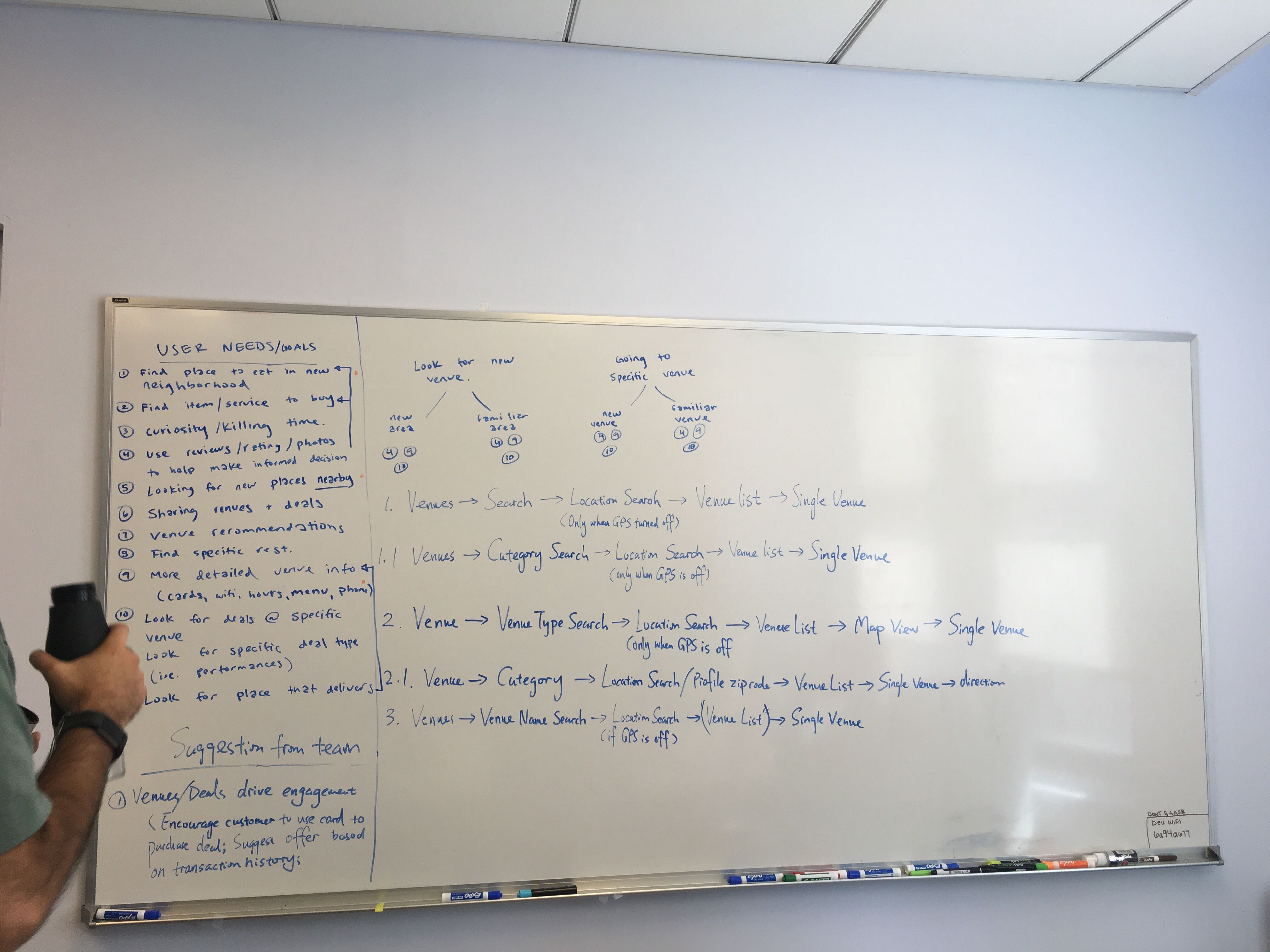
With the consideration of the problem I found at the first stage, we conducted the first round user test to figure out how user felt about current features and flow. It was designed as a card sorting test where i printed the features into pieces and asked users to group them as the right structure they have in mind. Also users were asked to arrange the main categories by the frequency that they used most often. I documented the results and log them into a list of slides to discuss with my fellow designers. We found out “Finance” was the feature user used the most. And the off canvas menu confused users to navigate through the app.
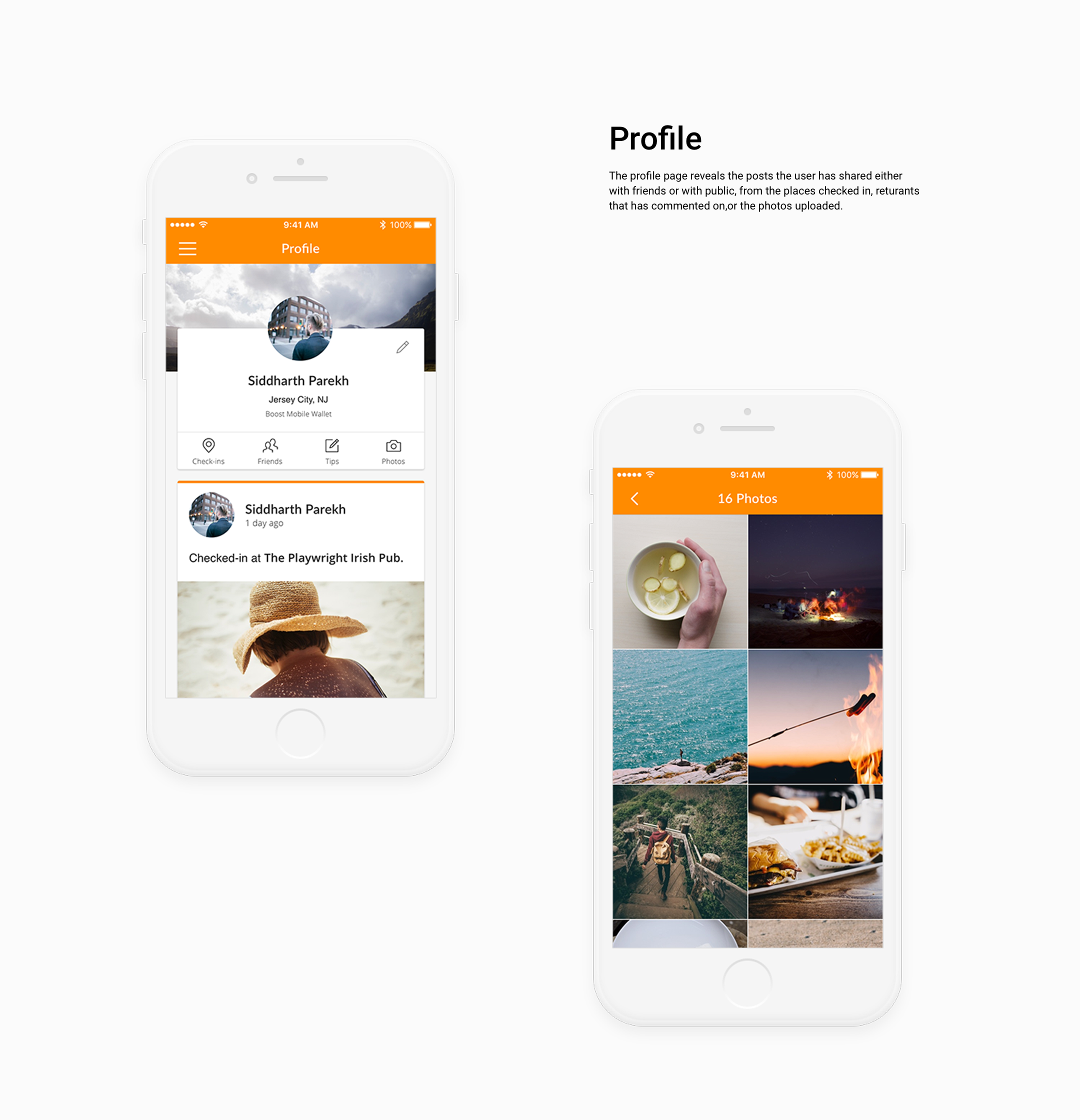
Based on the feedbacks we gained from card sorting and analysis, we brainstormed how to improve the current user flow. We came out 4 main features - finance, social, feed and profile. Among these, finance and social are two largest feature to focus on.In order not to increase the usage of other sections and not to make them feel like independent ones, we added some new features in social section to encourage user to employ the card so it got related to the Financial section. And I modified the original feed area for its updated design on just post thought or photos. Instead, the feed feature would be for sharing places or deals to users, or add a post where you hang out with friends and tag them, owhich was supposed to encourage the user to add an action.
3.3 iOS redesign - Wireframe Creation
Since the feedbacks we gained were mostly positive, we dived into sketches and wireframe design based on the flows redesigned. Before the stage, I took the time to list all the screens we have and started to consider the design consistency with the new design guideline. Also, since the main purpose of this redesign was also to improve the overall UI/UX, we decided that we're going to schedule more user testing with paper prototypes/wireframes given the budget we have at the time. The tasks of user testing is then defined, and was divided into 3 sub tasks:
- • to view the balance of your card
- • to find a resturant where you paid dinner with your card and split the bill with friends
- • to share the resturant and tag your friends with others
While producing the wireframes, we conducted the another round of user test with the draft low fidelity wireframes to see whether there was some usability issue and also once again to confirm whether the user flow made sense. We asked users to perform the tasks. I observe, document and analyse user's behaviors and questions. When reading the notes I took down, the second round of user testing gave us some really valuable feedbacks. Switch from financial info and social feed is easy to navigate from landing homepage. And it is very unclear for users how to split bill from the spend. Social Feed and Venue/Deals homepage look very similar thus confusing, it was hard for users to tell the difference at the first sight. The export button will be mistaken with share button, etc.
This user testing showed quite a few unexpected results too. For example, users rarely use the Venue search function. However it's important for us from business standpoint. I found this results will be add value to our iOS redesign project - this pain points should be addressed.
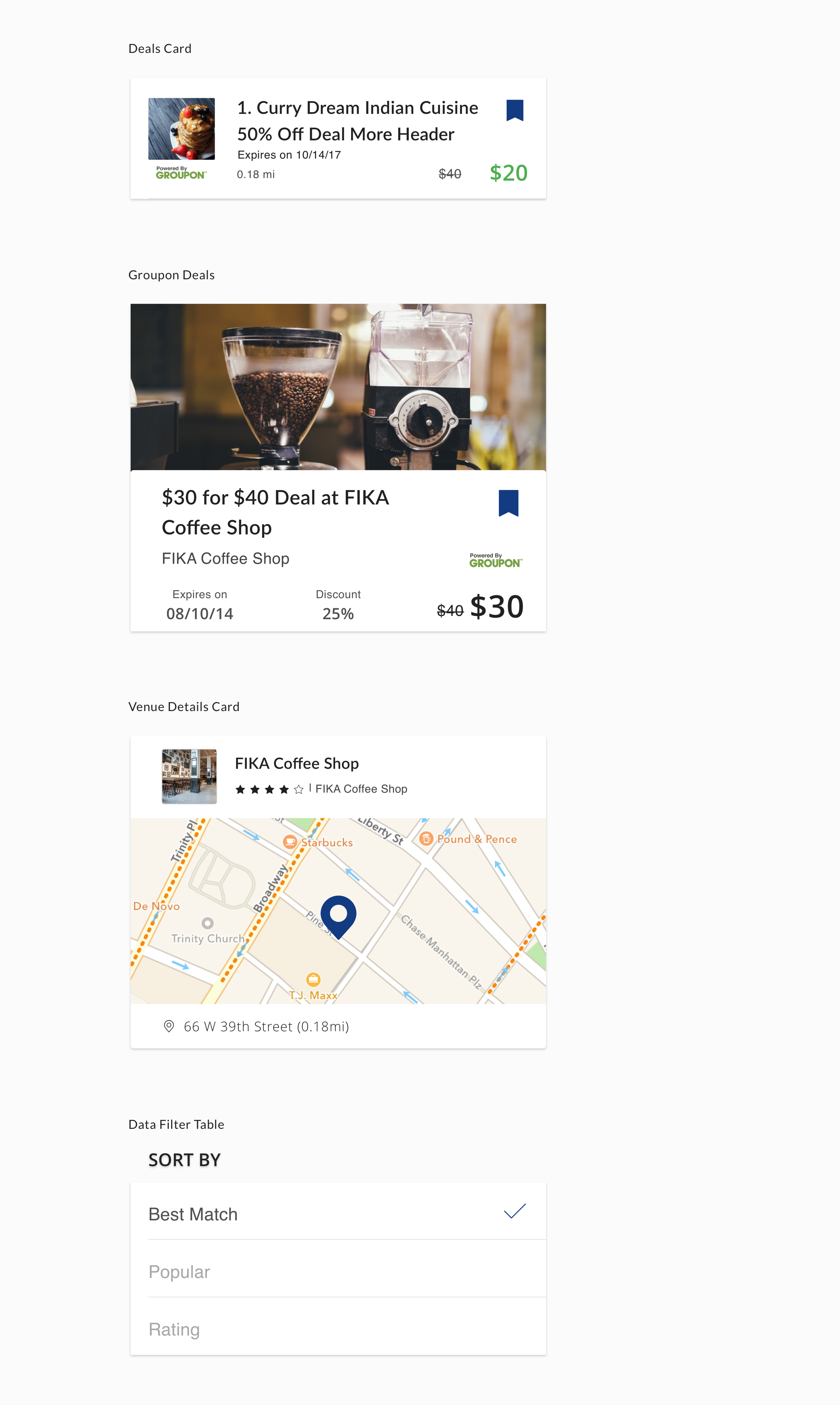
We applied the feedback back to wireframes as well. Eventually and collaboratively, We made over 50 screens in total. I was responsible for the complete deals and most of finance section, as well as the Venue search section. Below are a part of the collection.
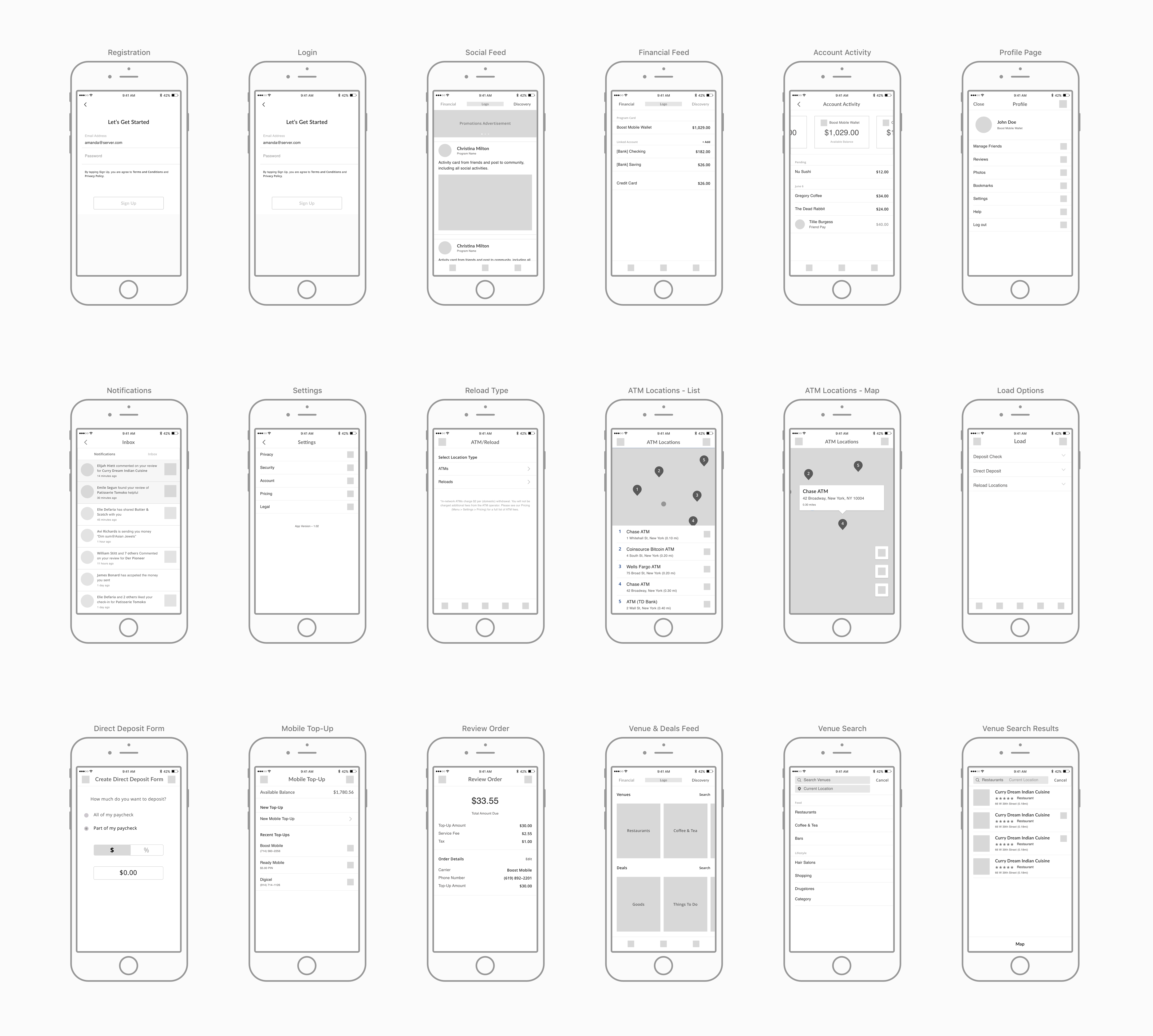
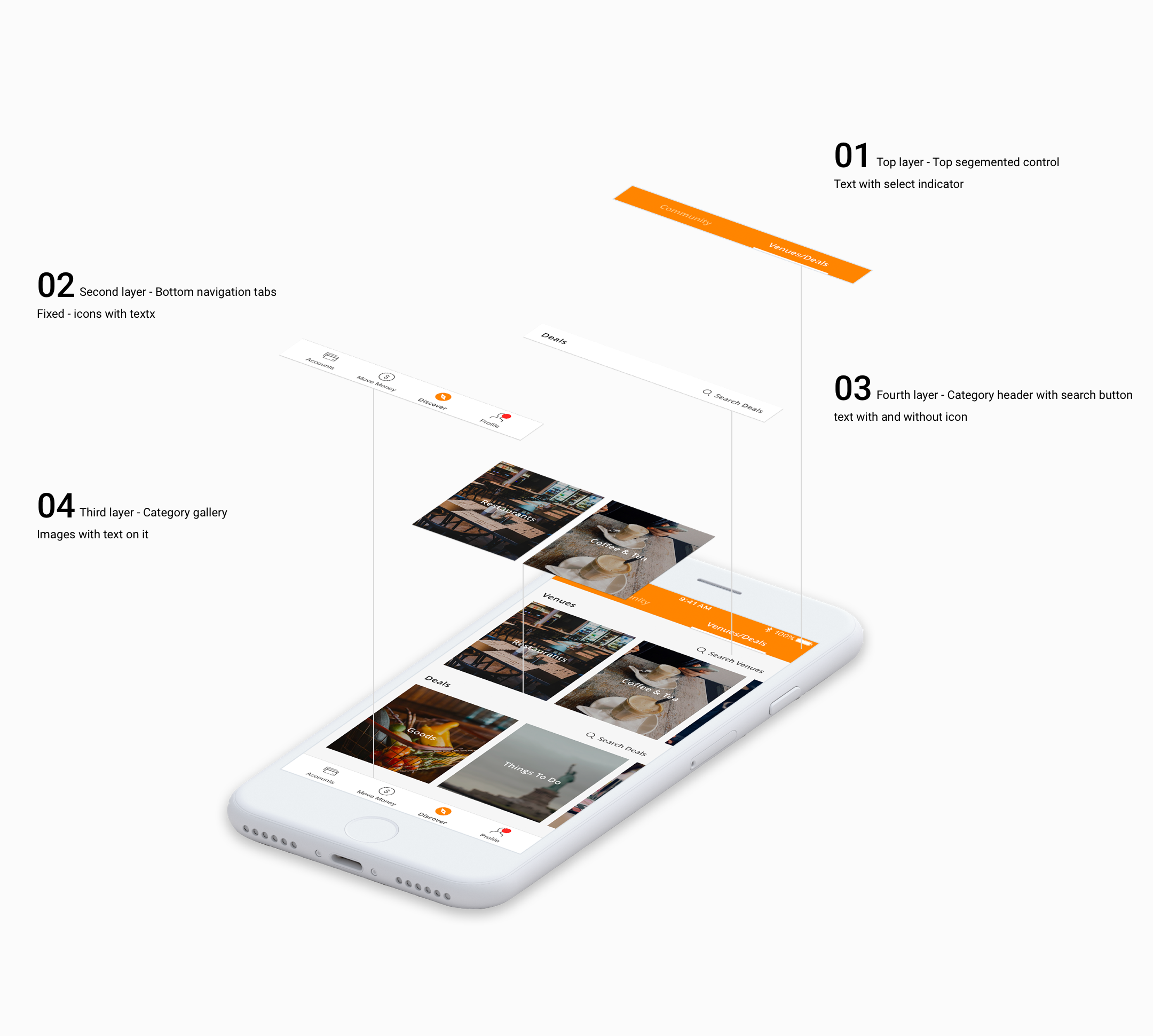
3.4 iOS redesign - UI Proposal
4. The icons, illusttrations & Motion Graphics
4.1 icons
Along with the redesign process, i re-created the icon collection to make them more fit into the overall app redesign. Updated from filled icons, they are now stroke only. Stroke icon goes with the clean UI and easy to recognize when navigating through the whole app.
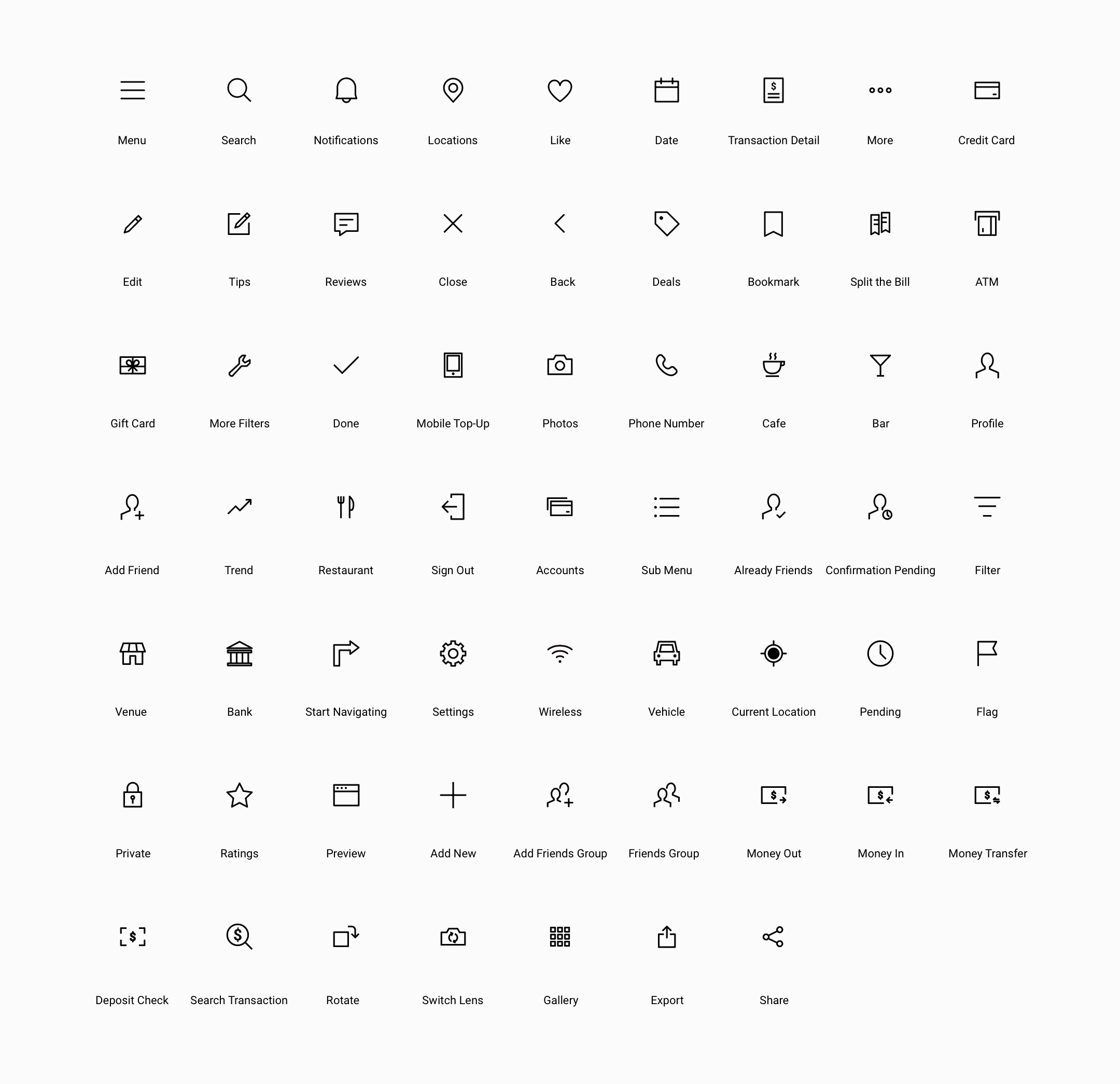
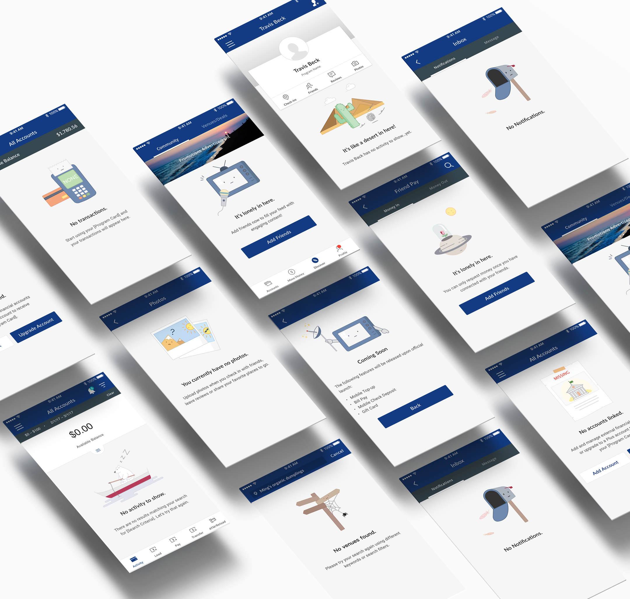
4.2 illustrations
Also, Urban FT's app used to be in a serious business design style. Ever since we revisit the business goal and target user/personas, we went for a light mood, vibrant design style. That's when I created and added a bunch of fun illustrations into the app.
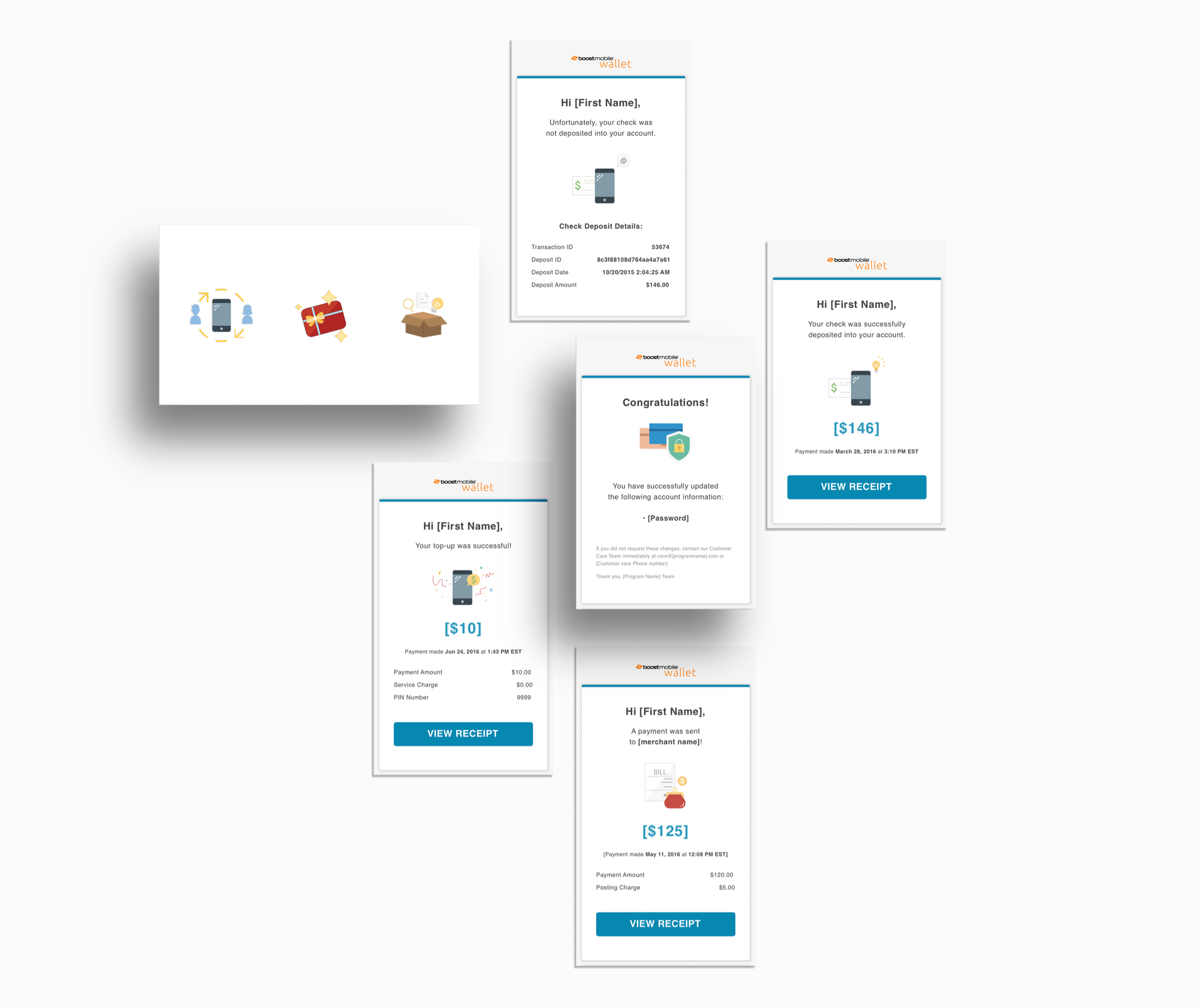
and adding a few more into the email we're sending out
4.3 Motion Graphics
And they are being animated!
I also made the animation for onboarding
5. The Website
One of my earliest project during the period I was in urban FT, is to design an one page website for the product we were launching on back then - the Sprint MoneyExpress.
Sprint MoneyExpress enables user to sign up a prepaid debit card, and users can download the Sprint MoneyExpress app to track the usage of the card, while it also comes with social features. Client wanted the website to be clean, clear and fun.
I sketched out bunch of ideas and created several variations of wireframes. As a feature-focused informational website, I designed the wireframes to display more information/features. I then narrowed the final options down to 2 versions after quite a few meetings with team members. In the later A/B testing we released to websites at early stage for users to compare - one is traditional one-page static website while the other one implemented with animations. The most feedback we got is scrolling the one-page website continually to reveal contents with subtle animations adds sufficient vivid visual elements to attrack users' attention on.
5.1 The Wireframe
Below are two examples of one-page scroll website wireframes, I then apply another quick round of user testing to get feedback on the layout of the website.
There could be some motion graphics for the left wireframe to display the information as users scrolling, while the right wireframe can also have the content - image and text - changed. My idea would be having an iphone mockup there and change the feature screenshot accordingly.
It turns out people like the combination of these two wireframes. I then go ahead and create the final wireframe aimed at addressing our primary user’s pain points and goals with new features displayed, meanwhile respecting the three guiding principles.
- Highlight Primary Features: Minimal design to keep page clean yet the content clear to users thus they'll notice the core value of this app to hit our conversion goals.
- Story Telling: To draw users attention so they'll stay on page to get the full idea of the whole new set of features.
- Be Consistent : The goal is also to reintroduce Sprint Money Express app and card and encourange users to pre-register, we want to make sure we can quickly established the value of this goal as well.
5.2 The Final Visual Design
The final screen along with a UI Kit and a red-line doc were sent to the development team as part of the project handoff.
5.3 The Live Prototype shows how scrolling work
This is the full video recording mimic when users scroll through the page. The data shows within 3 days of website releasing, we got 175% pre-register rate increasement, and users keep providing feedback saying they like this website and have already recommend to their friends to check it out too.
Created by Jinyi Fu