BoardEffect - Discussions Section Redesign
Since BoardEffect didn't have a designer previously, developers and product managers created all the UI and UX work.
BoardEffect is a Board Portal software, which means it's a type of secure, paperless software or app that allows the users to communicate with other board members, share documents, annotate meeting minutes and more without any of the risks or waste that a paper board book provides.
Feature Background
BoardEffect provides directors and administrators on a board with a discussion feature which enables users to open up a public topic to talk about, or start a private thread to involve only selected members on confidential information. Within this feature, users can also set the status of discussions as often times boards discussion are time-sensitive and highly related to the board meeting. Admin can also archive a discussion if he no longer wants other directors to access the discussion but just wants to put it on file.
Problem Statement/Pain point
The current design of discussion adds confusion to users therefore they would rather use ways of communications and jump back and forth between boardeffect and other messaging tools.
The goal of this project is to clean up the discussion section, to make it easy to use, clear to navigate, and no obstacle to communicate with other board members.
This is a web-only feature.
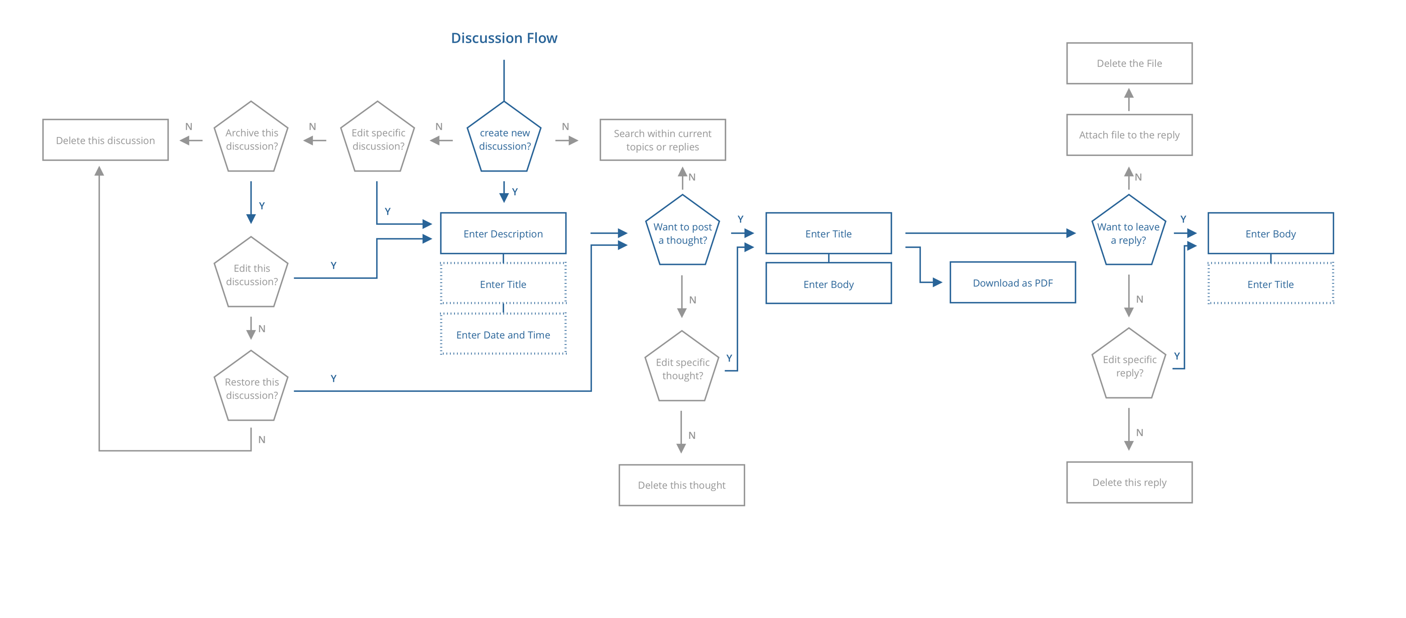
Current User Flow and Screens Analysis
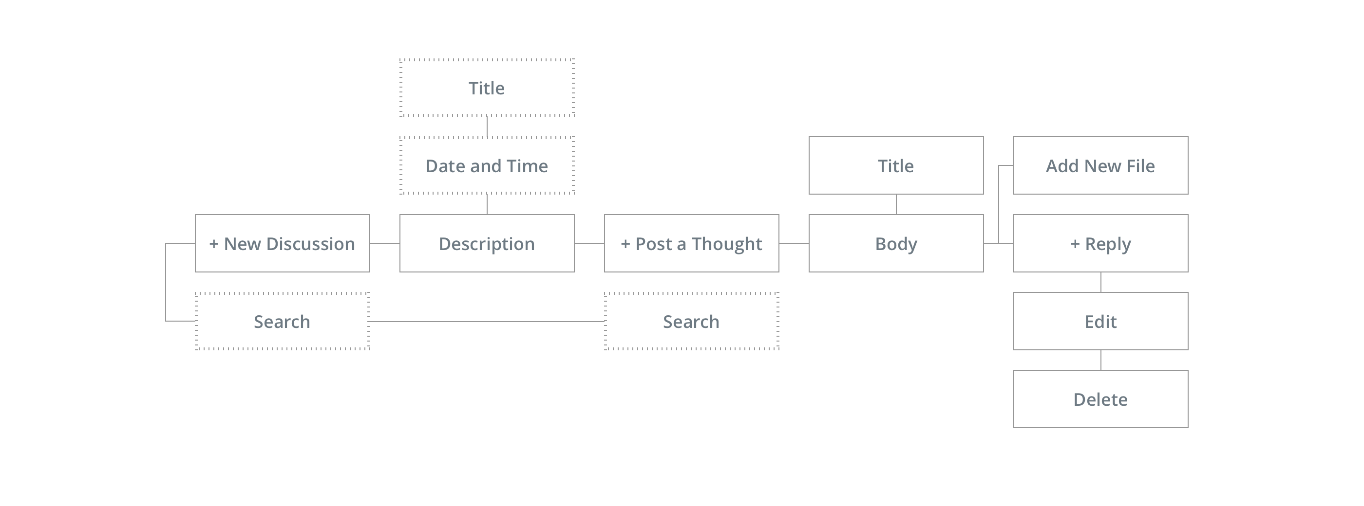
I created the current flow of discussion section to the simplified version. As it shows above, create discussion -> create thoughts -> create reply is the main flow. Generally speaking, that's a common flow used for creating discussion. however, the hierarchy of the current screens and elements placement confuse users.
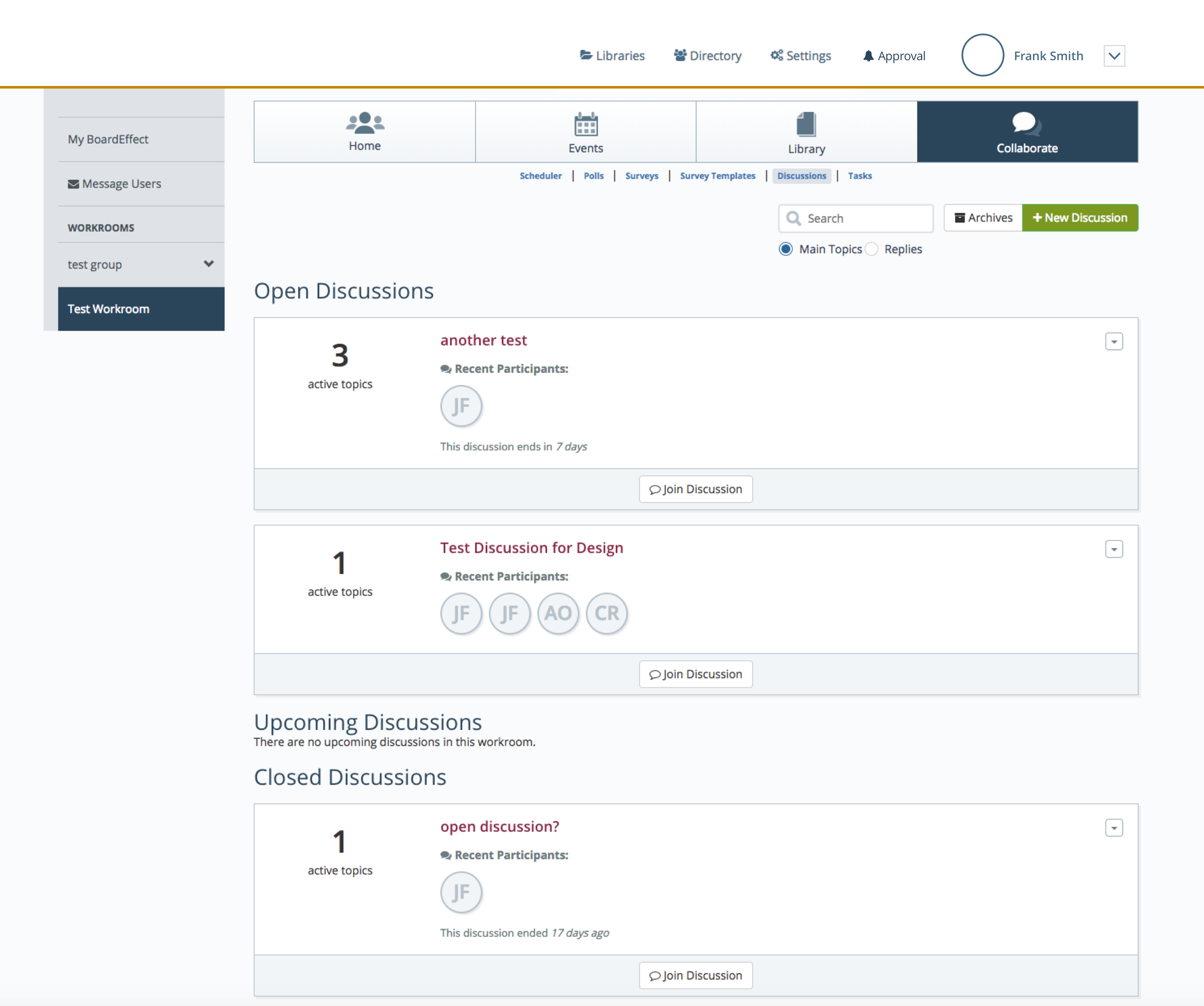
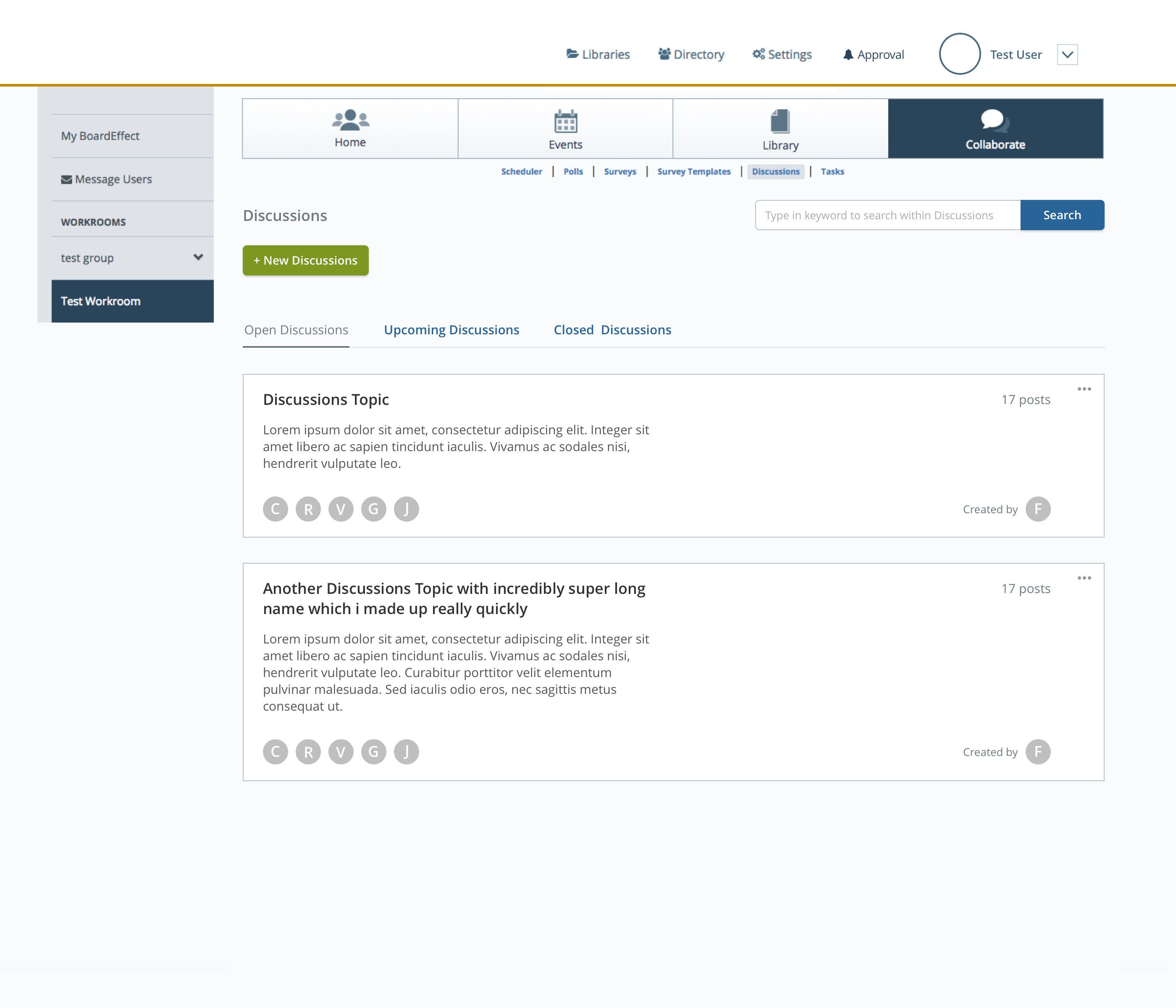
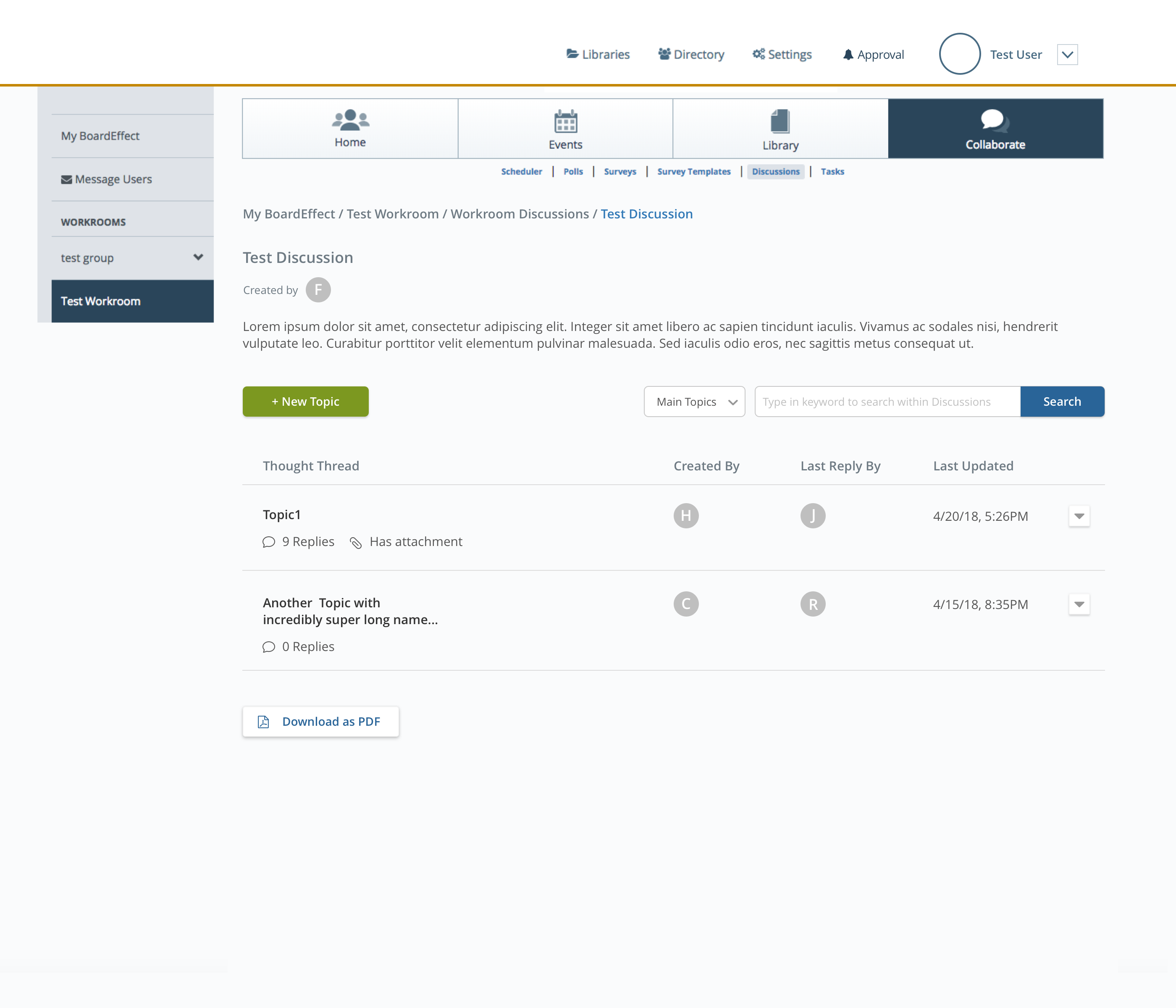
Discussions Homepage
• All the Open Discussions, Upcoming Discussions and Closed Discussions are displayed on the same page.
• The search input box too close to CTA will sometimes confuse users as they accidentally type something in the search box and clicking the CTA button as "Enter" key on keyboard to confirm searching - the assumption got confirmed by customer success team as well, they received similar feedback.
• The radio buttons underneath shows weak relationship with the search box.
• Recent Participants on the discussions card isn't important enough to take on such a large space to display the info.
• We have the clickable discussion card title, the "# of active topics" clickable text, and the "Join Discussion" to navigate user to click into the specific topics. Among these because the "Join Discussion" Discussions is sitting on a diffferent color and away from the main part, it'll get easily ignored by the users.
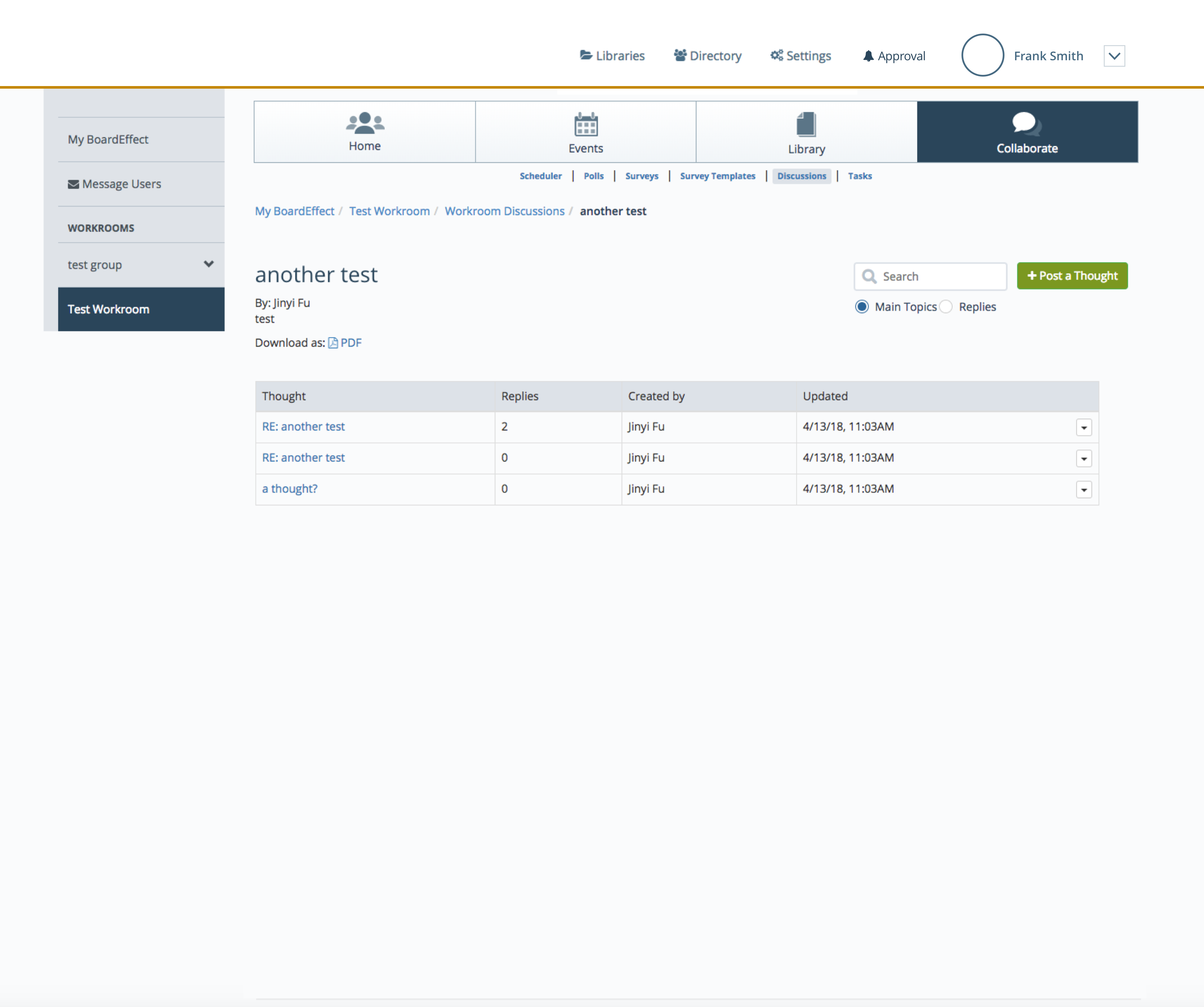
Thoughts Page
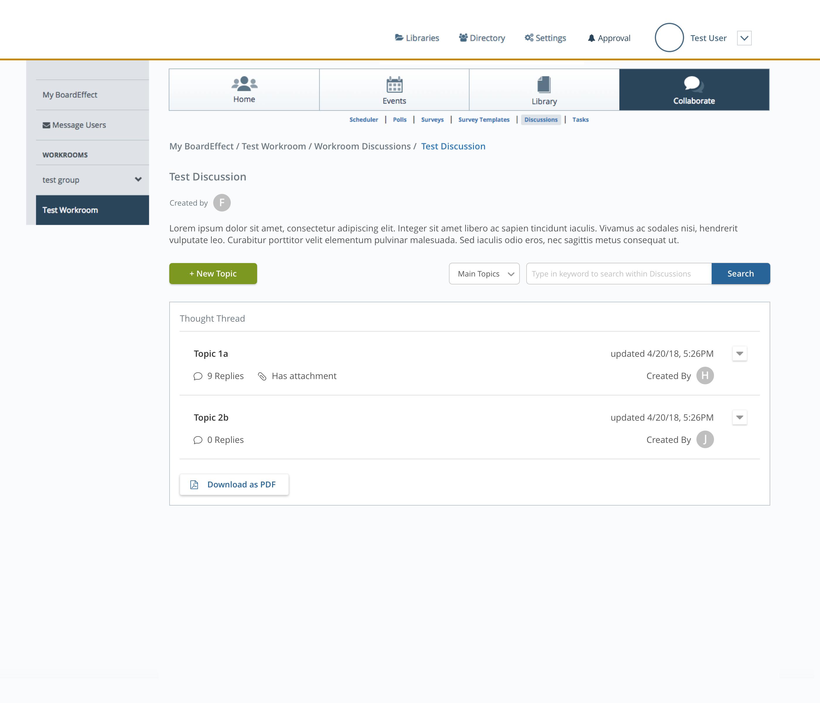
• The "Download as PDF" is misleading: which part will be downloaded as PDF if user clicked on this button? The Discussion topic information or the list of the thoughts?
• The relationship between "Discussion", "Thoughts" and "Replies" is still not clear.
• Currently there's no pagination for a long list of thoughts/replies.
• There's a disconection of the treatments between discussion cards and thoughts table list.
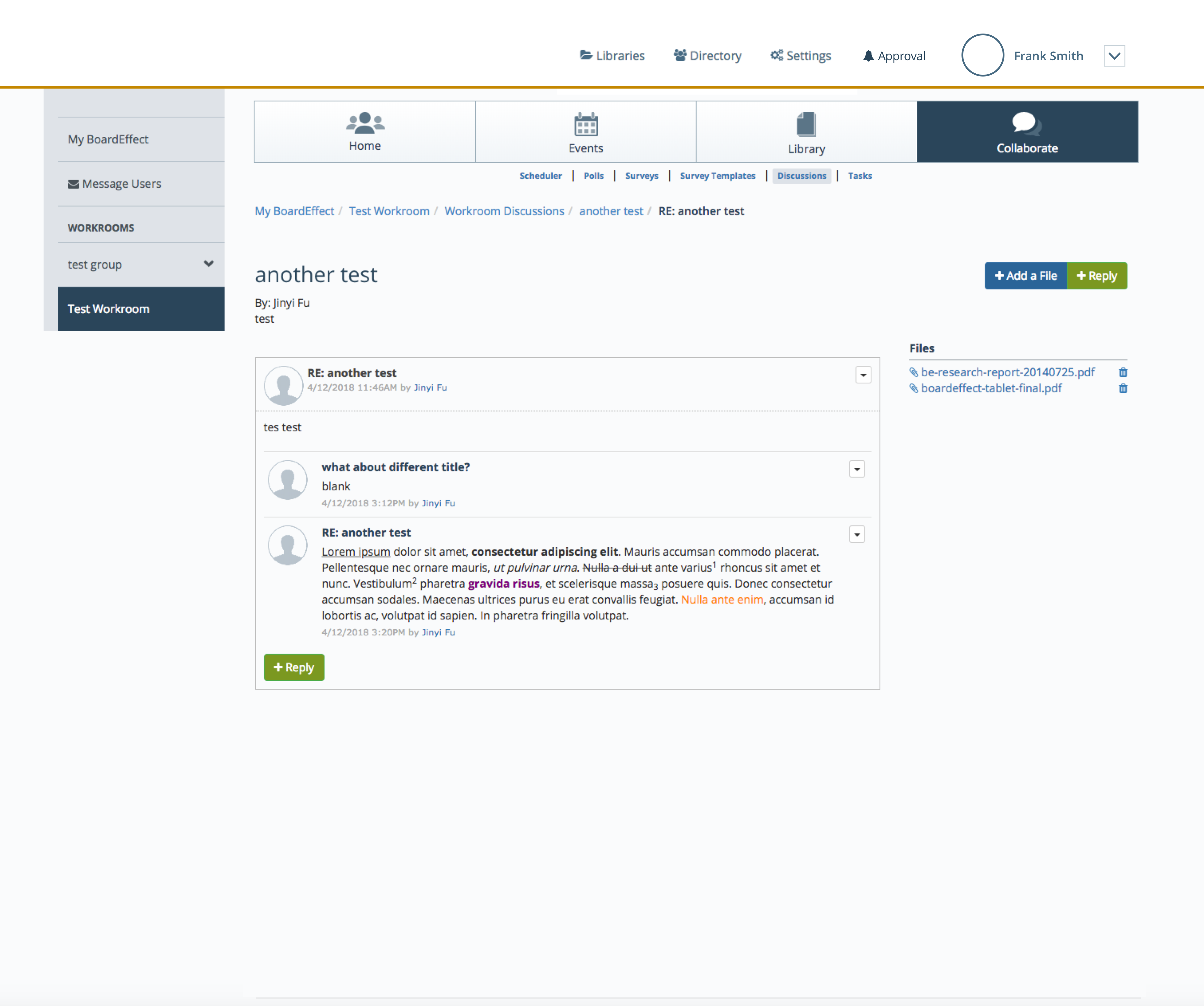
Replies Page
• Another different UI treatment for the list.
• Generally speaking, one CTA button is sufficient for one action. Having two "Add New Reply" buttons will confuse users.
• There's no relationship shown between the replies and the files.
• I did a quick demo to other team members who are not familiar with BoardEffect. And up to this point, they are all confused with this section and don't know what to do if they want to open a new thread. It shouldn't be this hard to follow along. And I had some ideas to improve the experience.
The Persona
Brett
Board Member
Has been serving on boards over 5 years
About Brett
rett is a small business owner with two small automotive supply and repair shops in Fort Collins, CO. Business has been good. Because of this, he decided he should give back to his community with his time.
He serves on two Boards of directors for local non-profits. One of the Boards he serve on uses the BoardEffect system to help planning meetings and share materials.
He use BoardEffect mostly on its web platform.
Behavioral Considerations
- More comfortable with a wrench in his hand than a mouse and keyboard, he wants the application as easy to use as it can be.
- Frequently needing to reach out to other board members to discuss some details about the meeting, or share some important documents.
- “Keep it simple, Make the interface obvious. Show me what i need, when I need it.”
Frustrations
- BoardEffect isn’t as useful as it appears at first glance. his board makes use of other services like SurveyMonkey or even emails though BoardEffect has components for discussions and surveys, voting.
- It’s been difficult to collaborate with other board members. He uses a separate communication tool with the others to gather their feedback while discussing pressing topics.
Goal
- Collaborate with board members much more easier without leaving the application.
- Streamline the process of creating discussions.
- Doesn't take a log of learning to get used to the new Discussions section.
User Flow
The original flow is simple enough. However, in order to ensure that all functionality in original feature is accounted for - i.e there's no feature loss in the new design - i added all the possible user interactions into the flow to make it more detailed.
Performed quick user testing one more time with the user flow only, and discussed with Product manager, I suggested we changed the "Thoughts" as it's not clear enough within the structure. It then be changed into "Topics"
Also the "Download as PDF will download all the topics with replies within the discussion so it'll appear in the Topics level. - we got feedback from users that they'll be more frequently save the whole discussion content.
Sketched Wireframes
Most of the patterns for discussions or posts feature are cards, or in the thread comments style.

Becuase of the complexity nature of boards strture, the most common layer for the Discussions feature is 3 layers. So I just kept the hierarchy the way consistent with original settings.
In the meantime, I do have some flexibility of restyling the screens so to make it straightforward and easy to navigate for our users.
/
Restyling drafts for Discussions Homepage
• Separate out the search box and "Add New Discussions" CTA button
• To display the members within the discussion with the profile image - use initials instead for those who don't have profile pics.
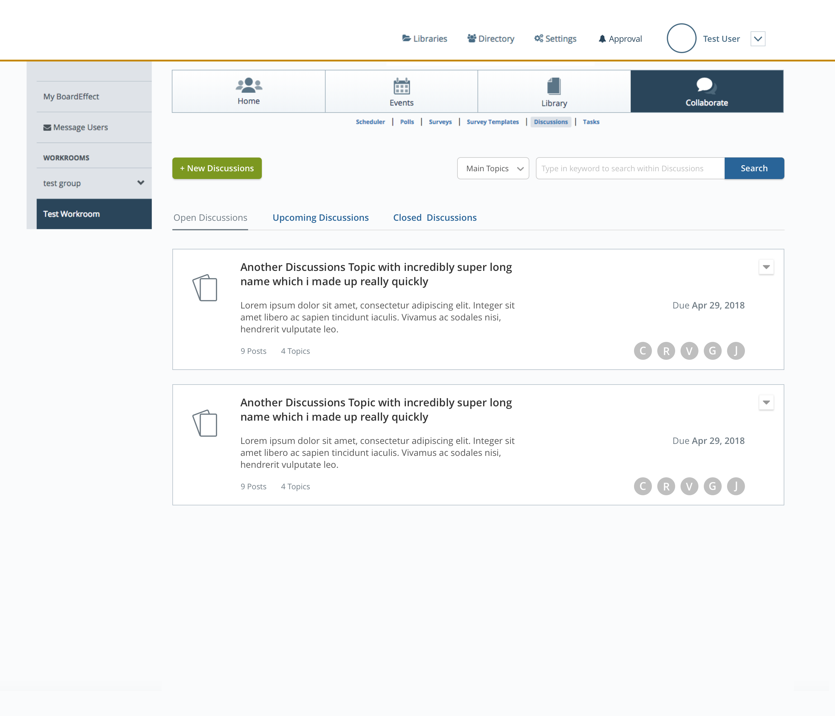
• To place Open Discussions, Upcoming Discussions and Closed Discussions into tabs so users can switch between these easily.
• Display the due date, available date or end date on the card.
• A dropdown on top left for users to choose the discussions type from.
• Display the latest post on the card so users save time if he just wants to know if there's anyone replies.
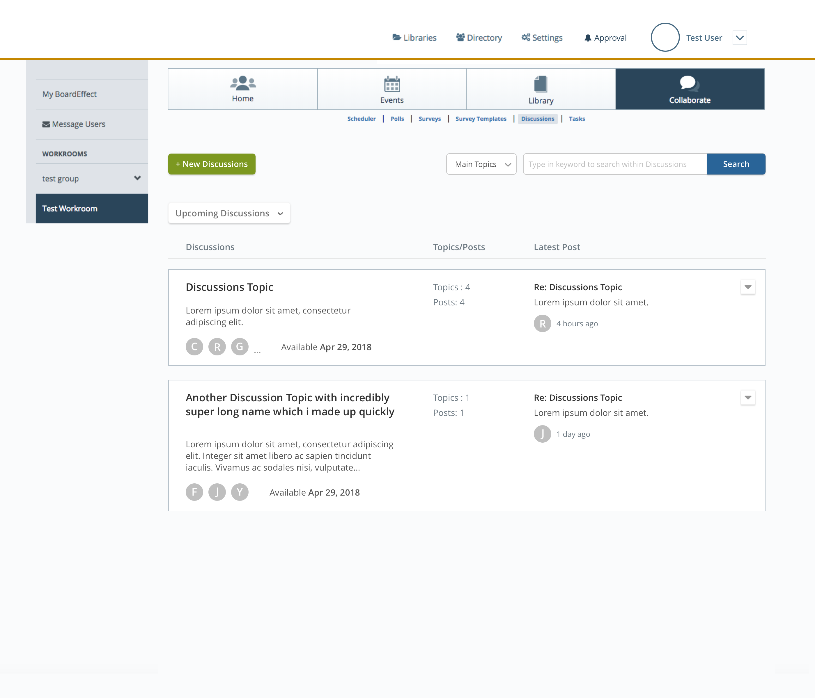
Restyling drafts for Topics Page
Display the amount of replies within this topic, and whether or not it has attachments.
Besides the info displayed in v1, display the user profile who left the most recent reply.
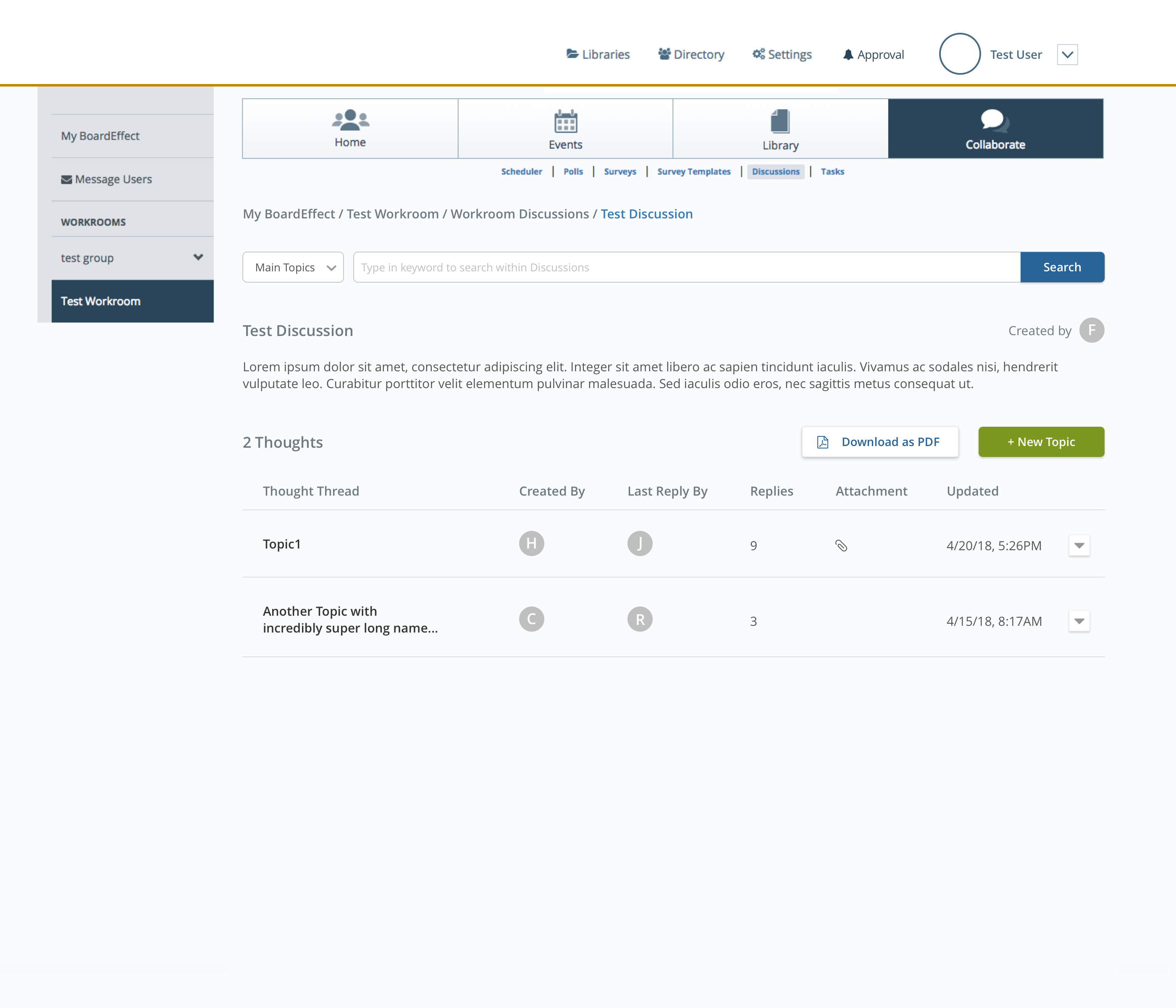
Similar to v2, except placing the "Download as PDF to the top along the side of "Add New Topic".
As for the replies, i decided to go with the current blog-reply style as during research i found it's a widely-used pattern for the topic-reply feature.
And I tested all of the design variations with fellow designers, product managers, and customer service advocates. In order to make the design consistent, and the flow easier for users to follow, applying cards approach seems most reasonable for both discussions homepage and topic page.
Internal Usability Testing - Validation & Iteration
Because of the B2B product nature, the easier workaround for me to test is to set up demo sessions with customer success team. Being in the team for a really long time, they gave me extremly good feedback in regards of the discussions section.
It was several back and forth discussions and modifications during the long process.
The feedback I received and some notes I took while I'm exploring are:
- Displaying the amounts of topics and replies one discussion has on the card is important for the user to get an overview.
- The Tab approach is easier for users to navigate consider the fact that our users are elder and not super tech savvy, they'll prefer to be presented with clear options.
- The discussion card icon is nice to have, but since we don't have various types of discussions having the icon there makes the card cluster, and not beneficial for future mobile-optimized display.
- Having the members' profile images displayed is clear, but how would it look like when there are a long list of paticipants?
- Since we have search across Discussions hompage and Topics page, the placement should be consistent.
- Again, we'll keep the card style for topics in order to keep the experience and UI consistent throughout the section.
And some general design guidelines for this feature
- Should make the whole discussions section clear enough for users that for structure is Discussions -> Topics -> Replies.
- Ensure the way the process works is very intuitive to the user so there's no extra learning required.
- Keep in mind consistency.
The Final Design
Below is a partial walkthrough for discussion section, where a user lands on Discussions homepage, can continue to navigate to Topics page and Replies page.
(Due to the file size limitation, a full walkthrough is available upon request. I can provide more info as well.)
The feature released at the end of Q4 2018. After the release, the data Customer Success team collected shows users increased the usage of this section drastically who are also satisfied with the new UI.
Reflection
BoardEffect's web platfrom is based on the workrooms/work groups, I was surprised that the data shows users hardly ever using the collaboration tools we provided. Talking to users before I jumped into sketching really helped me to understand the hurdle. The outdated look and no direct @ function are the main reason to turn users off and switch to other message tool.
I noted down some takeaways from my project diary:
- 1. The project is originally just a reskin one - meaning the scope of it is just to "make it pretty"(quote from a feedback summit). I felt there's more reasons behind it to for the low engagement rate so I push the timeline for this project far enough to get some time for me do the research and the conversion with product managers, users and customer success representatives.
- 2. The redesigned Discussion still has the 3-level structure, which is to accommodate the boards meeting structure. While most discussion feature has two levels, I was trying to push for 2-level for this feature as well but the feedback from users shows they still want the extra level so it would be easier to distinguish the discussion around specific topic whether it's a document or the agenda item. I follwed up with feedback submit with customer success representatives and was told the structure is satisfied by users. We're super happy that the increased engagement rate raised up so quickly and drastically.
- 3. There are quite a few areas in BoardEffect's platform similar to Discussions, piece by piece I will update and redesign the platform to make it not only useful, but also easy to use.