EquityEffect VC dashboard Design
TruEquity is an equity management platform, for tracking stock and options. It is the one source of truth for a company's equity, but also gives companies a clear understanding of how future financing and liquidation events affect the company - and therefore allows the to make informed equity decisions. TruEquity also provides accounting option expensing tools.
After the acquisition, the product will be in package with BoardEffect and will be rebranded as EquityEffect.
Description
Till date, TruEquity has been mostly focused on private companies, but following the Diligent acquisition we are more heavily focused on investors, specifically venture capital firms (VCs). Vcs can have hundreds of companies which they invest in (referred to as portfolio companies), through the VC's funds.
Finding the Problem/Pain Points
Previously the way VCs managed these investment data before was just using paper, pen or excels. Yet there's no way for them to easily switch between the companies overview and company details view. It's time consuming and inefficient considering how busy they are day to day. They need a overall view of the investment data, which will enable them to get information quickly glance, and will either navigate them levels deeper to view specific company data, or just stay updated with overall data since it's changing real-time. The problem now becomes how might we enable VCs to get information efficiently with this newly added dashboard.
The Challenge
Some challenges I'm having in this project:
- 1. Choosing the best layout for information displaying and listing the data.
- 2. Simplify the UI so the users won't need much time to get used to the pattern.
- 3. Meanwhile, the UI should be consistent with Diligent's other products especially BoardEffect since these two will be integrated in the near future.
I started from knowing nothing about VC's terminology, and it took me some time to do research and talk to product manager, as well as customer analyst to get into users' shoes. Later I got connected to clients talk with users to understand their needs. Also as a dashboard, it's a question for me how to come up with a layout to group related information without result in heavy data cluster.
Competitor Analysis
Before I started this dashboard design, I also did some competitor research seeing how they handle such use case. (I don't attach screenshot here since because of copyright issue)
There are some universal issues i found within these current solutions, either lack of fund sorting, or too much information makes the hierarchy unclear to users.
Whiteboarding and Brainstorming
I was on calls with product manager back and forth to finalise the goals of the project.
The finalized goal were set to be:
- 1. the VCs first point of access to TruEquity, giving them a multi company view of all their portfolio companies and the ability to click on a portfolio company logo and access its captable;
- 2. have all the financial metrics of their portfolio companies rolled up and aggregated to the dashboard;
- 3. see company specific financial metrics and waterfalls - quick access to this data instead of having to access the company's table on the "regular" truequity view;
User Requirement Analysis
Also the data collected from users show a list of items they'd love to see within the dashboard.
I collected the items and compile them into the use cases (considering the users from investor persona):
- 1. I want see in table view all my firm's investments searchable and sortable by fund and company so that I have one source of truth for high-level details related to our investment positions and current and future value;
- 2. I want to be able to see core financial metrics rolled up across companies and aggregated at the fund level so that I can understand the current performance of funds for internal and external reporting; .
- 3. I want to be able to see in a dashboard view (i.e., without clicking through to a new screen or tab) core financial metrics and key charts at the company level so that I can understand quickly our current position and value in each company in a portfolio;
- 4. I want to be able to run a scenario quickly from the dashboard view so that I can better understand future financial performance (and follow-on needs) of portfolio companies individually and how this impacts the overall fund.
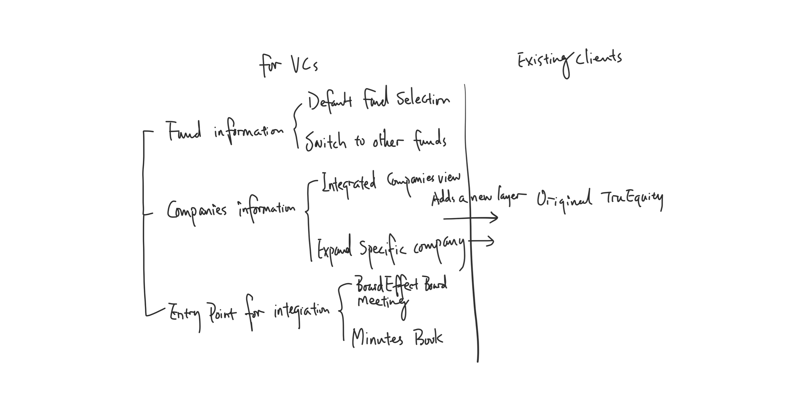
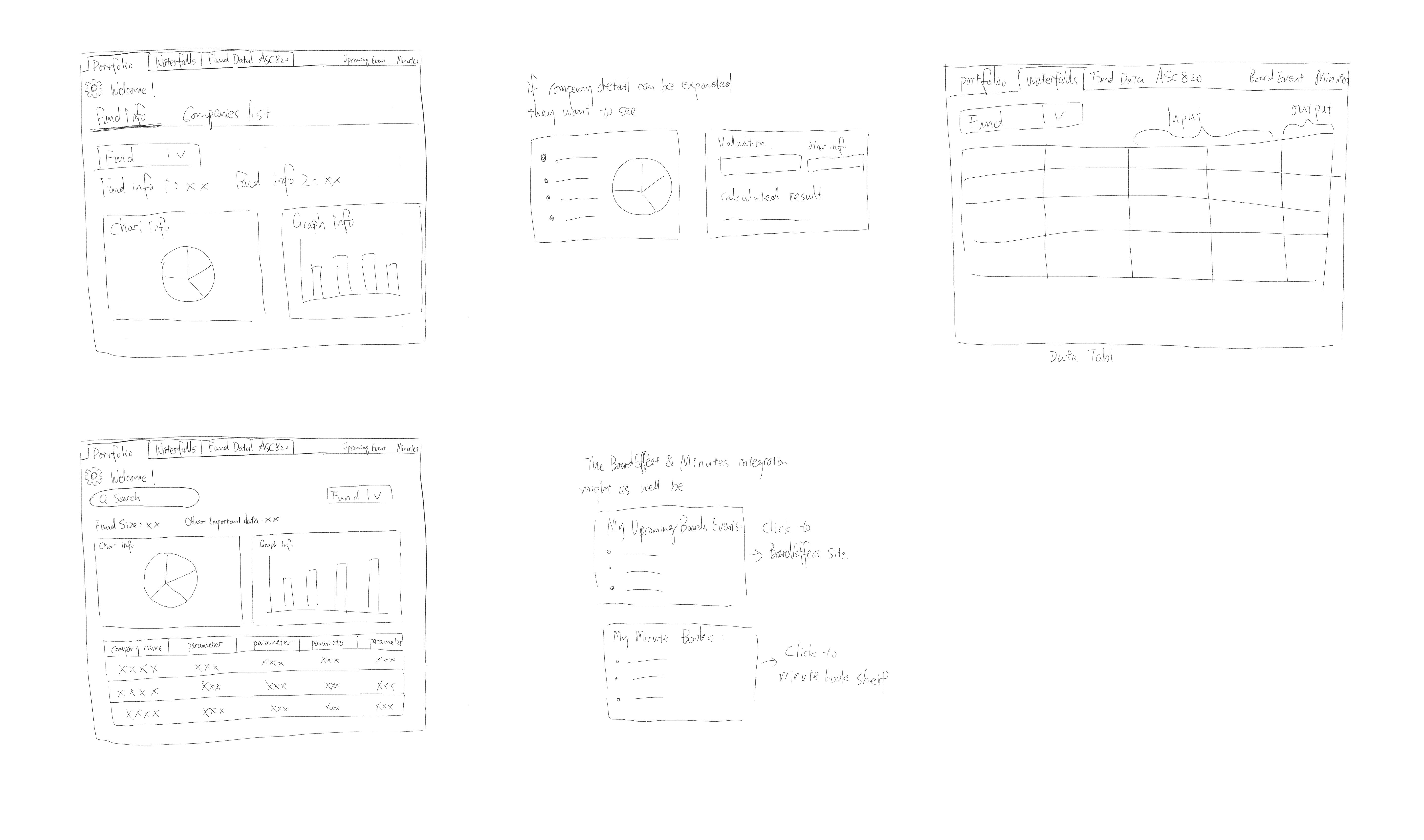
Some Sketches
Since we're adding this dashboard view a top layer besides the original TruEquity platform, there isn't an information architecture needs to be reframed. I then did some sketches to put my ideas of how to place the elements in different layout on paper.
Wireframes V1
Based on the sketches, I created these high-fidelity wireframes.
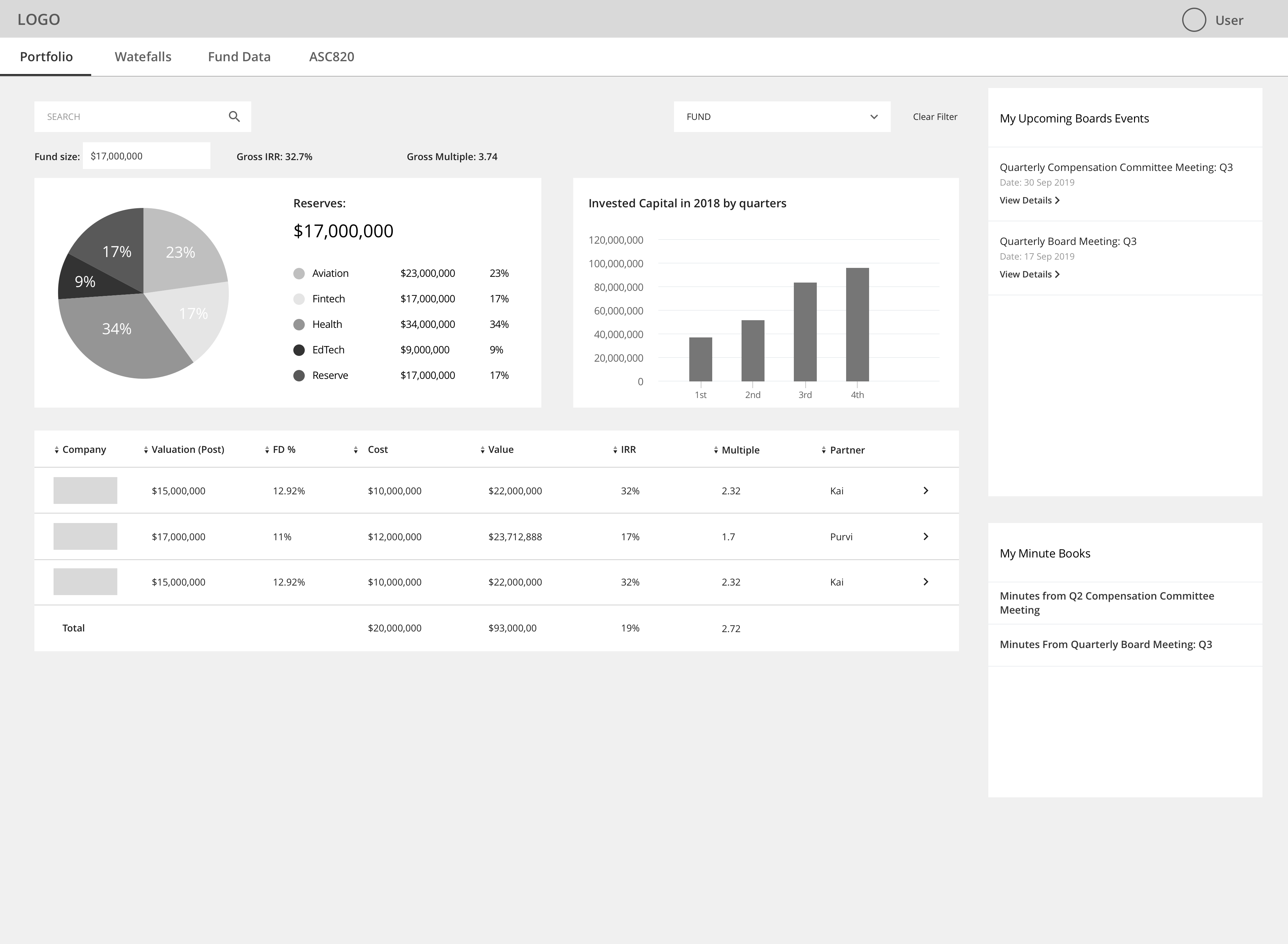
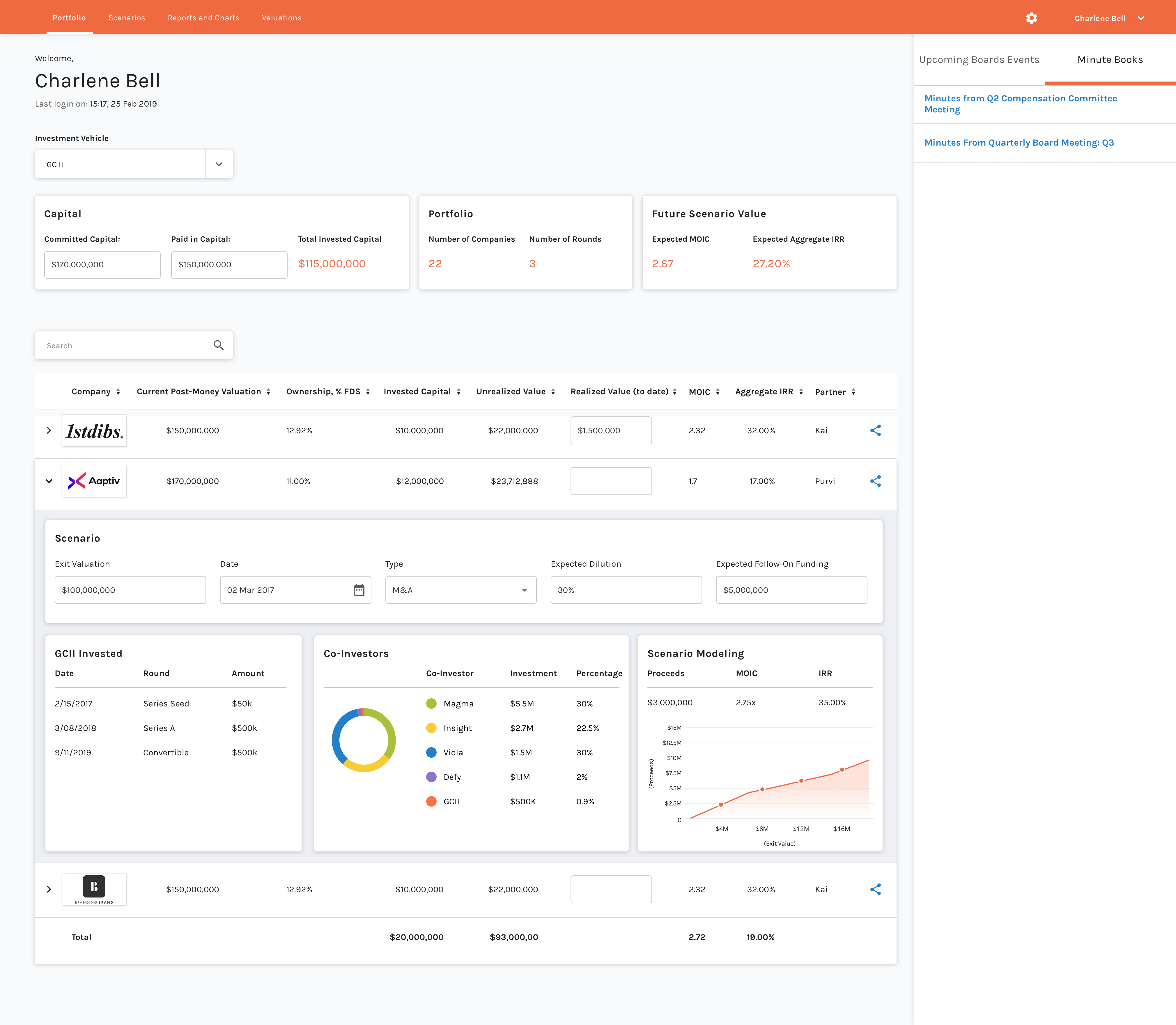
Investors land on this page with fund information and companies list open, on the right side they have entry point to Upcoming boards events and minute books link.
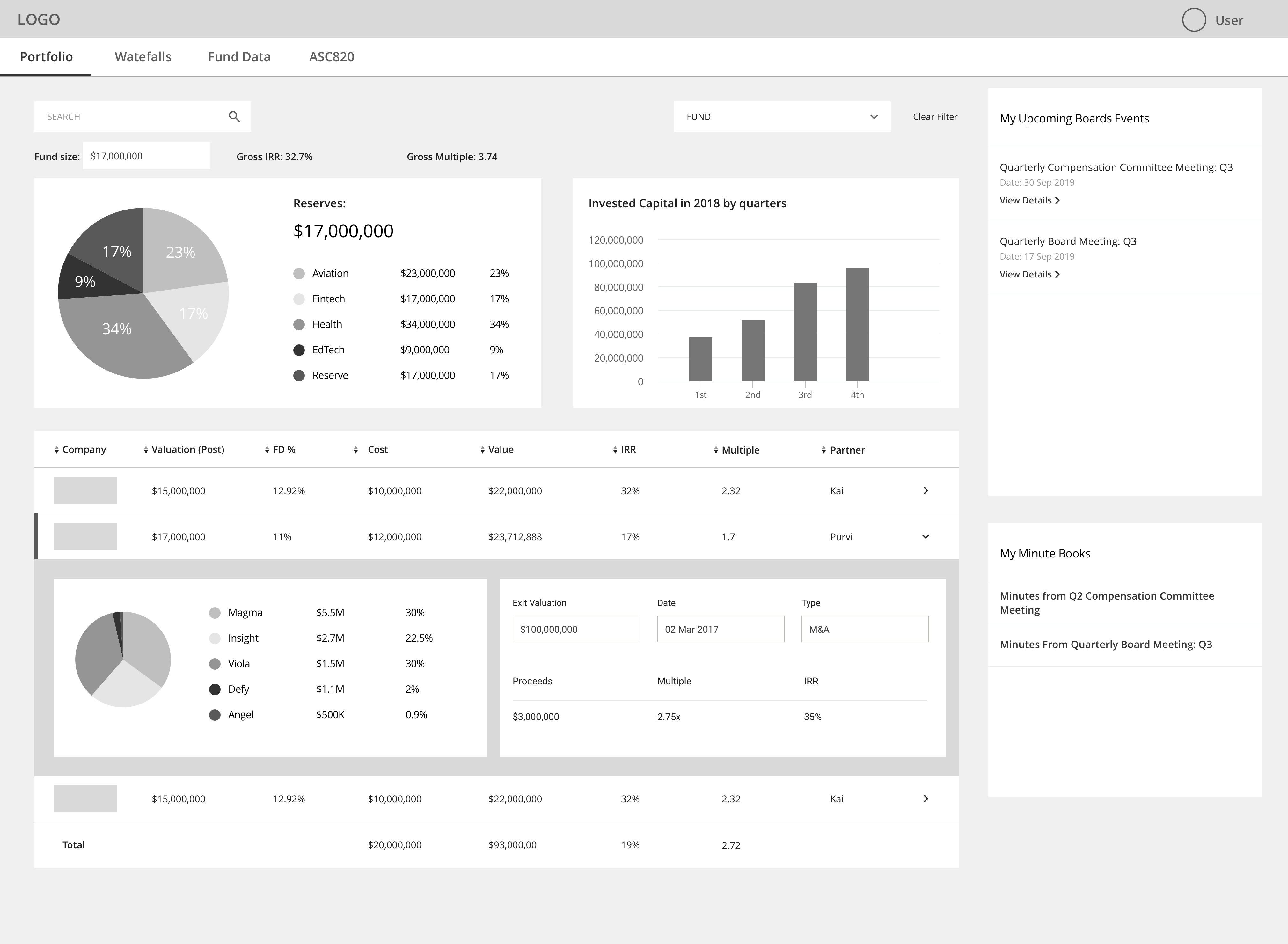
Investors and expand a company from the list to view a more detailed information like graphs before they enter into a single company portal.
Wireframes V2
With some tweaks, I placed the fund information and companies list into two tabs.
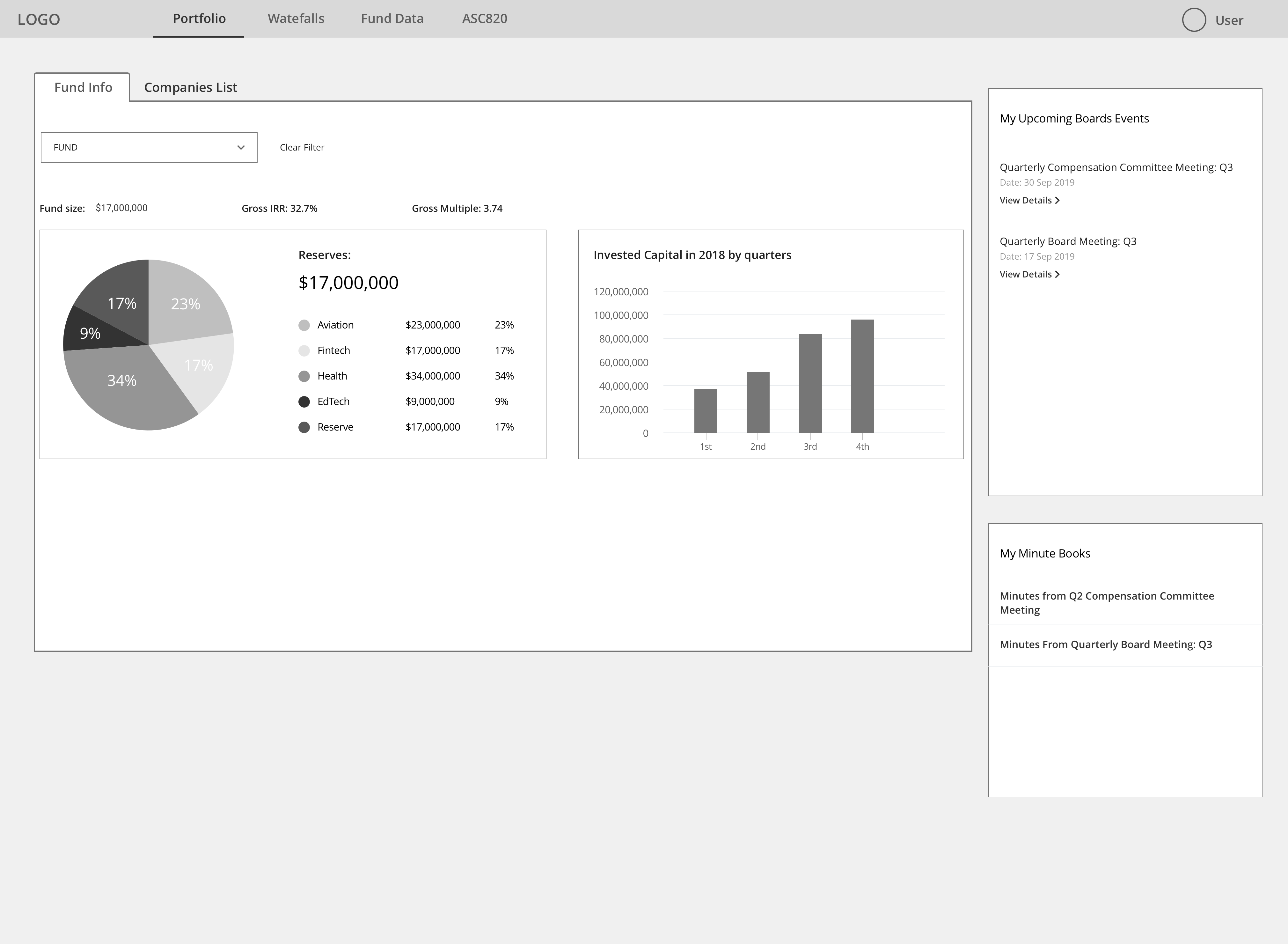
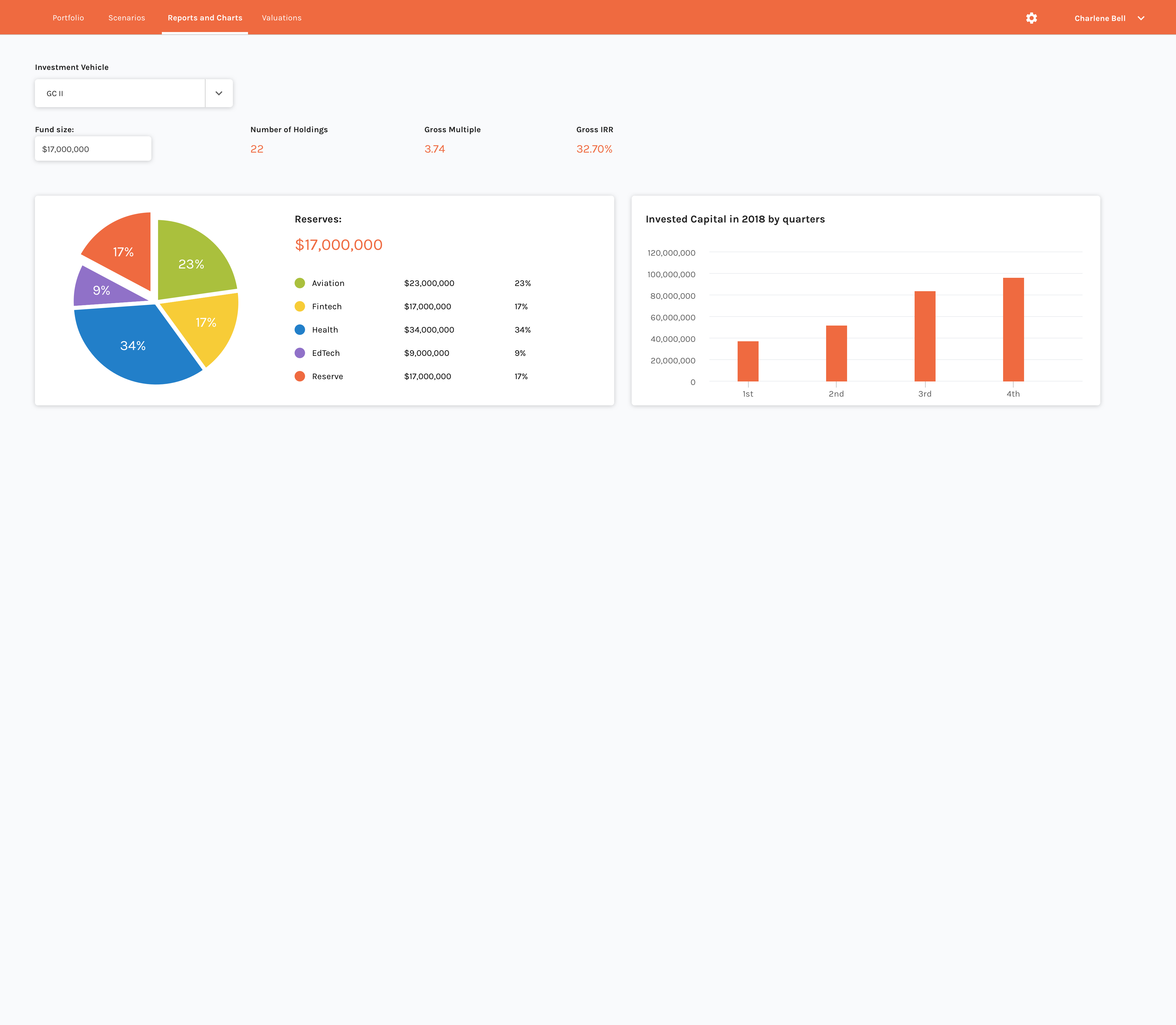
Under the first Portfolio tab page, users will land on this page with 2 views - one is fund information and the other is companies list.
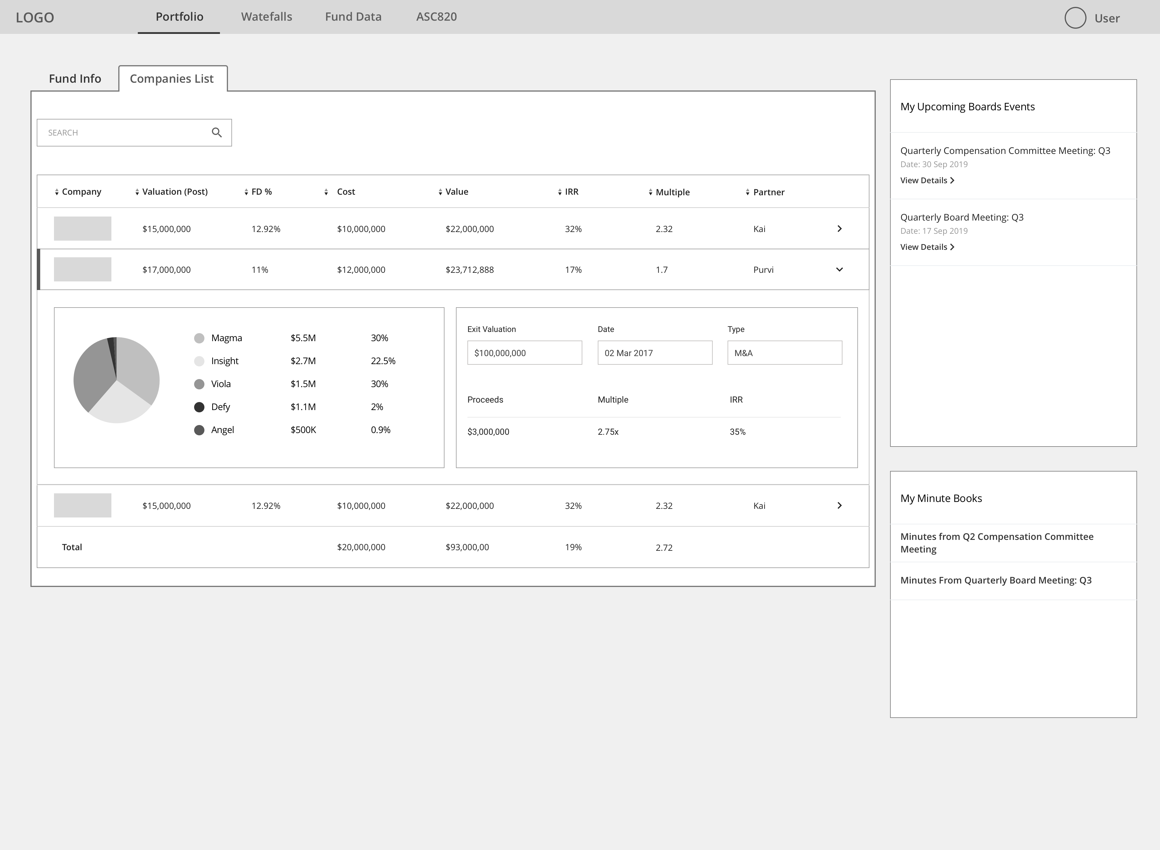
Users can switch between these two tabs to get two different views of information.
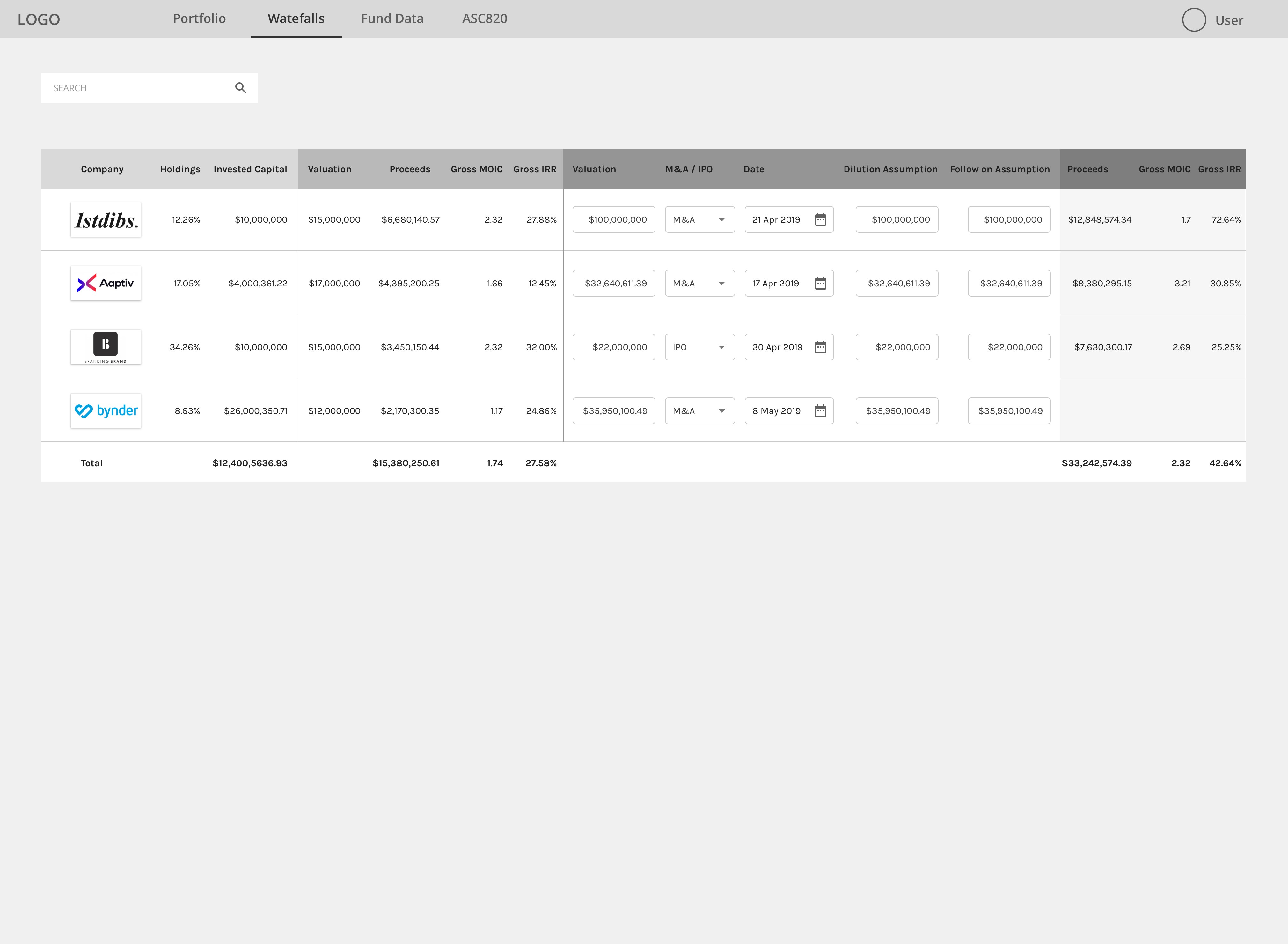
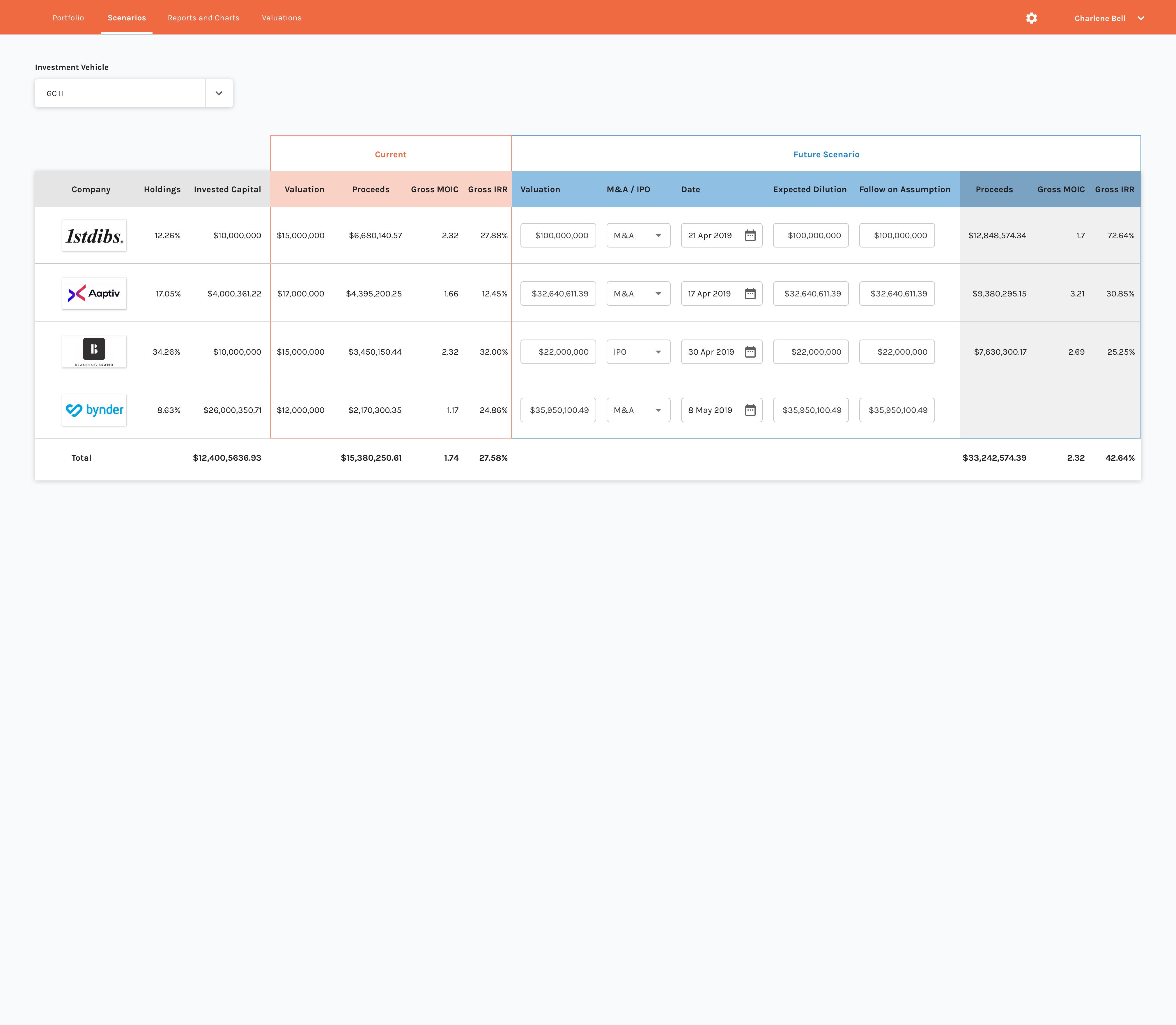
Added a new screen of "Waterfalls" tab page. To list the companies waterfall valuation in table.
Wireframes V3
While i'm testing the wireframes to get some feedback, since most of the users are non-power users and they are on a very tight schedule day to day, they'd prefer to see investment data consolidated into one view. For the BoardEffect and Minutes integration they would expect it to take less prominent space thus not to be distract from investment information. So I changed the layout of the integrations part based on v1 wireframe.
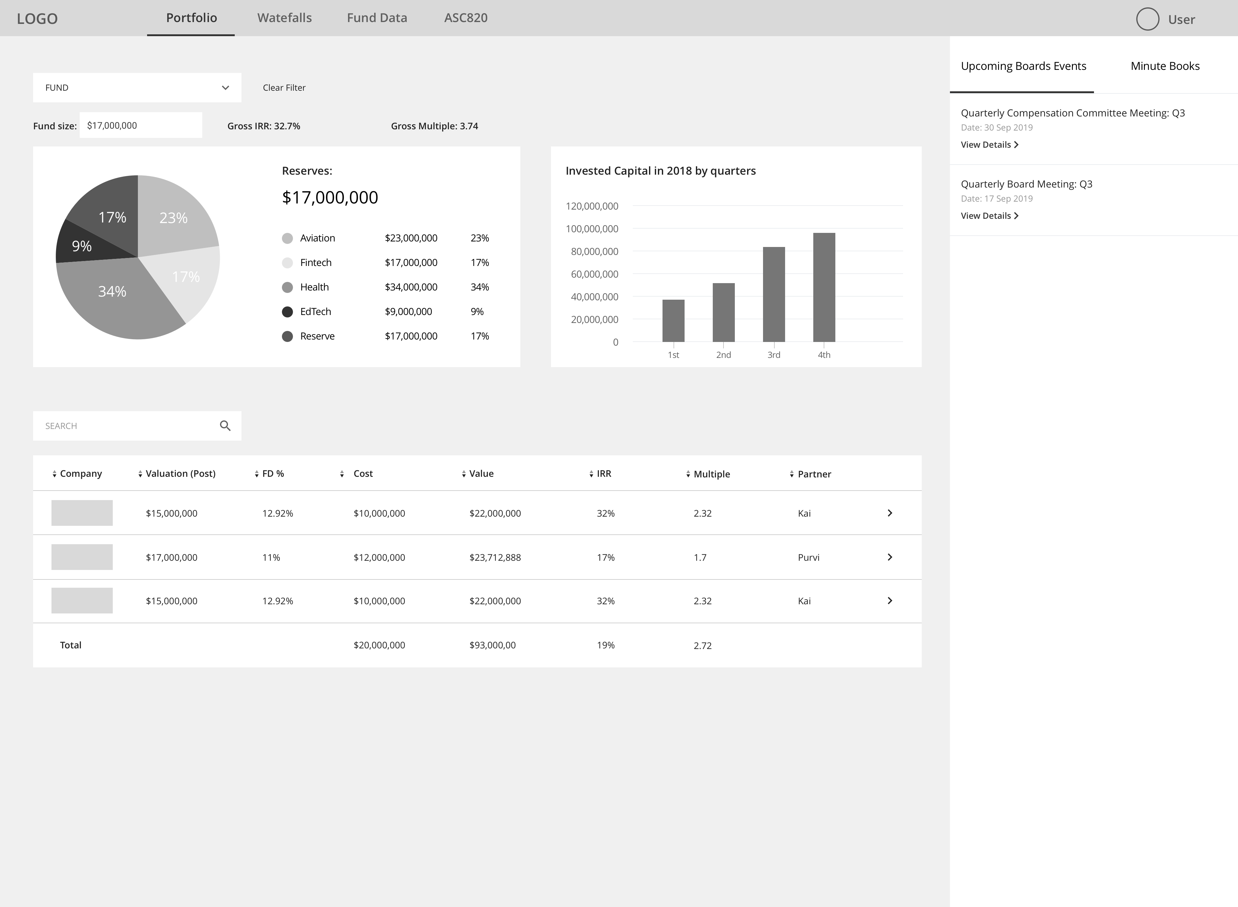
Based on v1 wireframe, users can switch between the upcoming boards events and minute books tabs.
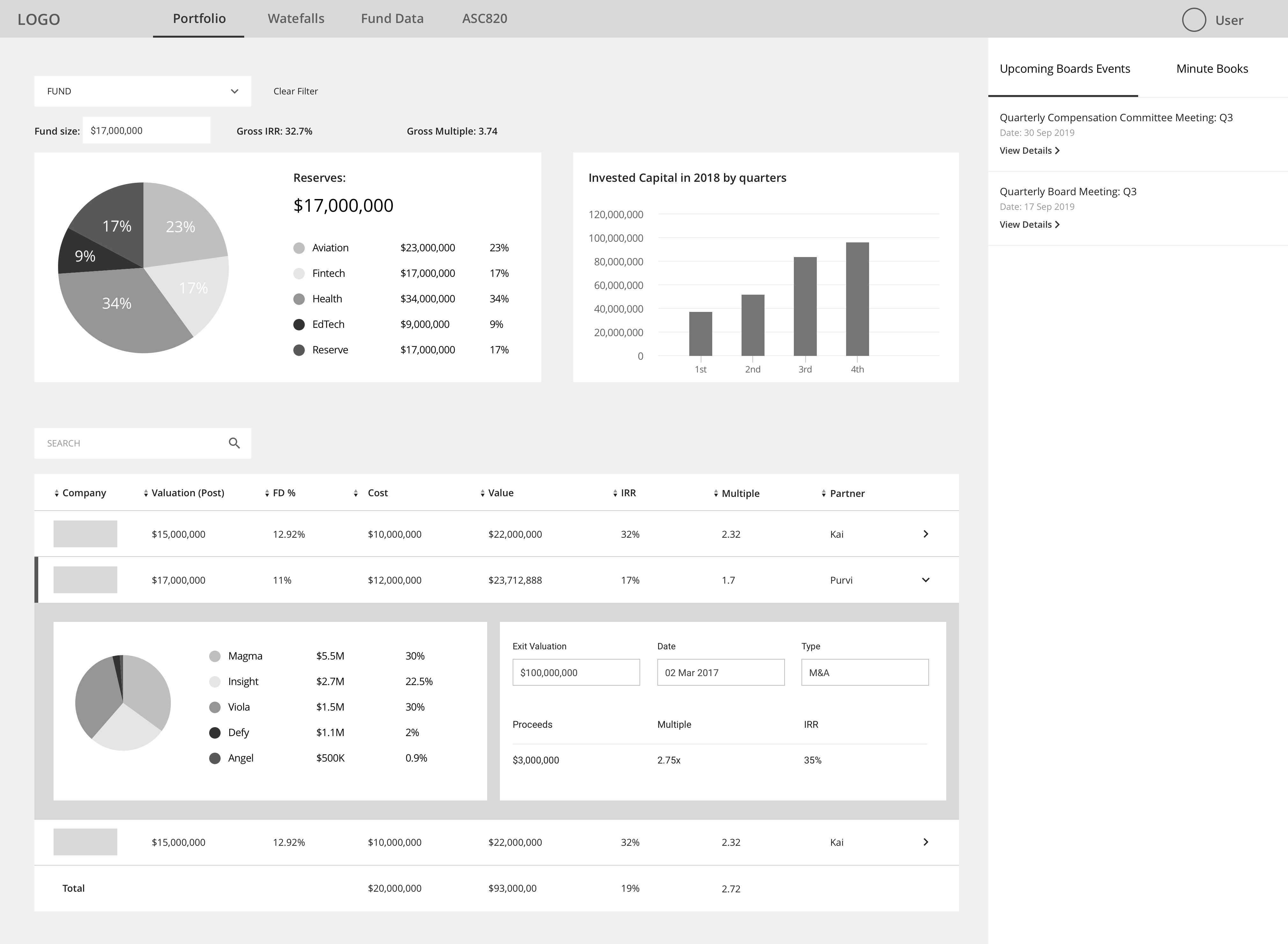
Ideally this side panel can collapse and expand to save space of homepage.
Screens Designed
With the rebranding elements applied on wireframe v3, i have the following screens (focus on the web version and first 3 tabs for current phase.)
UI Collection
Final Wireframe Feedback
We showed the designs to our clients and users, they were super happy with how it came out and really like the way it layout the important information upfront, with the embeded scenario running tool to model future valuation.
Style Guide
To make it easier for developers to manage the dashboard and the original TruEquity design (since we're rebranding TruEquity to add it into Diligent's suite of softwares), I used the elements from the new dashboard design as well as the marketing new brand elements to create the style guide. Having it will help our developers building the product using same standard across out brands.
Reflection
The dashboard design project came when I have some bandwidth away from BoardEffect product. I have designed dashboards before but this is the first one that facing to investors which is completely a new persona for me. The schdule is tight and there are some technical limitations, yet both internal team and beta users are happy with the new dashboard.
However I listed some takeways and reflections below:
- 1. On the research phase, I had to look into competitor's product and also talk to real users to get their input. However, the access to real users is limited because of the B2B nature. And one constraint for me is from a user asking not to make the UI and UX too much difference from one of the competitor's UI and UX because he's getting used to it. I tried to improve the layout and user flow, but cannot really reflect the flow improvement since this is only a top layer dashboard design instead of a whole product redesign/improvement. Eventually I wish there would be opportunity for me to inform my design to provide better solutions.
- 2. Keeping in mind that clients submitted requests asking about white-label, I didn't explore more options for color usage. Especially on the graph and the chart, I found a moderate color combination that works for white-label(match with whichever primary color most clients use) and keep it visually appealing and effective at the same time. Although that took less time I spent on sketching and wireframing, it's an accomplishment for me in such a small amount of time.